Interpolation in Spark#
In this article, we will impute some missing values in time series data. The PySpark guidance below has been adapted from another source.
Please note that there are many imputation methods to choose from, for more information see the Awareness in Editing and Imputation course on the Learning Hub. Before using this code in your work please consult other team members or methodologists on the suitability of this method for your use case.
We don’t want to spend too much time on the methodology here, the purpose is to give you inspiration on how to solve your own PySpark/SparklyR problem and maybe learn about some new functions.
It’s also worth mentioning that there is an interpolate function in pandas, so if your DataFrame is small enough just use pandas!
What is interpolation?#
Wikipedia says “In the mathematical field of numerical analysis, interpolation is a type of estimation, a method of constructing new data points based on the range of a discrete set of known data points.”
The DataFrame we will create consists of the columns area_code, period and count. To impute the missing count values we will use linear interpolation, which means to draw a straight line between two known points and use this gradient line to fill in the missing values.
The linear interpolation equation we will use is:
where
is the gradient between points 1 and 2,
\(y\) = linear interpolation value (count in this example) between \(y_1\) and \(y_2\),
\(x\) = independent variable (period in this example) between \(x_1\) and \(x_2\),
\(x_1, y_1\) = known values at point 1,
\(x_2, y_2\) = known values at point 2.
Create DataFrame and plot#
Let’s start with some imports and creating a spark session
from pyspark.sql import SparkSession
from pyspark.sql import functions as F
from pyspark.sql.window import Window
import pandas as pd
import datetime

spark = (
    SparkSession.builder.master("local[2]").appName("interpolate")
    .getOrCreate()
)
library(sparklyr)
library(dplyr)
library(ggplot2)
library(broom)

# set up spark session
sc <- sparklyr::spark_connect(
  master = "local[2]",
  app_name = "interpolation",
  config = sparklyr::spark_config())
As mentioned previously we will create three columns, area_code, period and count. Note that count contains some missing values to impute and period contains some mixed frequency points (points with differing time gaps between them) to make it more interesting.
df = spark.createDataFrame([
    ["A", "20210101", 100],
    ["A", "20210106", None],
    ["A", "20210111", None],
    ["A", "20210116", 130],
    ["A", "20210121", 100],
    ["A", "20210126", 120],
    ["A", "20210131", None],
    ["A", "20210205", 130],
    ["B", "20210101", None],
    ["B", "20210111", 85],
    ["B", "20210119", 82],
    ["B", "20210131", 75],
    ["B", "20210210", None],
    ["B", "20210215", 85],
    ["B", "20210220", None],
    ["B", "20210225", 75]
    ],
    ["area_code", "period", "count"])
table = data.frame(area_code = c("A", "A", "A", "A", "A", "A", "A", "A", "B", "B", "B", "B", "B", "B", "B", "B"),
period = c("20210101", "20210106", "20210111", "20210116", "20210121", "20210126", "20210131", "20210205",
"20210101", "20210111", "20210119", "20210131", "20210210", "20210215", "20210220", "20210225"),
count = c(100,NA, NA, 130, 100, 120, NA, 130, NA, 85, 82, 75, NA, 85, NA, 75))

sdf <- copy_to(sc, table)
Let’s bring the dataframe into pandas/our local R session ready to make some plots:
pdf = df.toPandas()
pdf.set_index(pd.to_datetime(pdf["period"]), inplace=True)
df <- sdf %>%
  collect()

df <- df %>%
  mutate(period = as.Date(period, format = "%Y%m%d"))
Now we can take a quick look at some charts to see what this looks like:
pdf[pdf["area_code"]=="A"].plot(marker="o")
pdf[pdf["area_code"]=="B"].plot(marker="o")
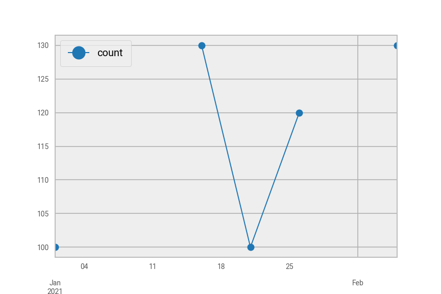
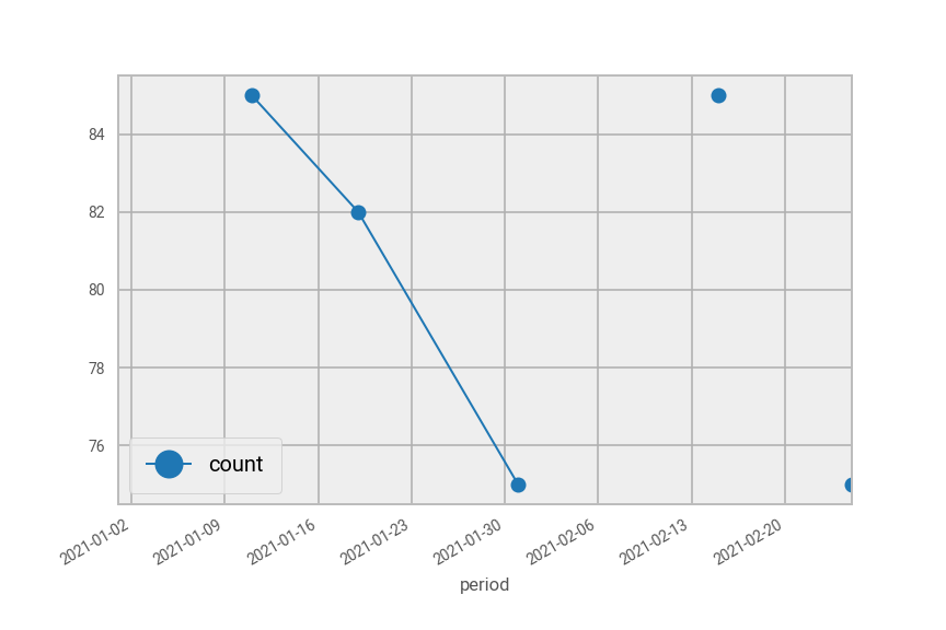
Fig. 42 Plot of pdf in Python split by area code “A” (top) and area code “B” (bottom).#
ggplot(df, mapping = aes(x = period, y = count)) +
  geom_point() +
  geom_line() +
  facet_wrap(~area_code, nrow = 2)
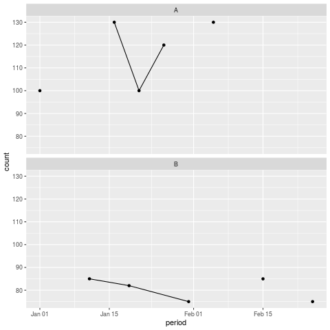
Fig. 43 Plot of df in R split by area code “A” (top) and area code “B” (bottom).#
As you can see, the lines don’t meet all the points because there are missing counts in between.
Interpolate#
To carry out the interpolation, we will first create new columns containing forward filled and backward filled counts and periods where the count is missing. Then, we will use these columns in the formula above to calculate the gradient and interpolated counts.
Here are the steps in more detail:
Add timestamp columns
Create ordered windows for forward and backward filling
Carry out the forward and backward fills on count and timestamp
Calculate the gradient
Calculate the interpolated counts
In practice there is often some cleaning to do with dates, here we just have a string in the format YYYYMMDD.
Before we impute any values we will create a flag to indicate an imputed value for the end user.
df = df.withColumn("impute_flag",
                   F.when(F.col("count").isNull(), 1)
                   .otherwise(0))
sdf <- sdf %>%
  mutate(impute_flag = ifelse(is.na(count), 1, 0))
Next we will need to create some new timestamp columns. The function unix_timestamp() will convert the period column into seconds since 1st of January 1970. We need one version of the column with missing timestamps corresponding to the missing counts, and another version including all the periods.
# Add timestamp for data we have only. This will be used to interpolate
df = df.withColumn("timestamp_with_nulls",
                   F.when(F.col("impute_flag")!=1,
                          F.unix_timestamp(F.col("period"), "yyyyMMdd"))
                   .otherwise(None))

# Add timestamp for all data
df = df.withColumn("timestamp_all",
                  F.unix_timestamp(F.col("period"), "yyyyMMdd")
                  )
# Add timestamp for data we have only. This will be used to interpolate
sdf <- sdf %>%
  mutate(timestamp_with_nulls = ifelse(impute_flag != 1,
                                       unix_timestamp(period, "yyyyMMdd"),
                                       NA))

# Add timestamp for all data
sdf <- sdf %>%
  mutate(timestamp_all = unix_timestamp(period, "yyyyMMdd"))
Next we create the Window functions to forward fill and backward fill the missing values in the count and timestamp_with_nulls columns. Note that for SparklyR we can skip this step, as we can just use group_by() and mutate() in the forward and back filling step to specify our window.
# Create window for forward filling
window_ff = (
    Window
    .partitionBy("area_code")
    .orderBy("period")
    .rangeBetween(Window.unboundedPreceding, 0)
)

# Create window for backward filling
window_bf = (
    Window
    .partitionBy('area_code')
    .orderBy("period")
    .rangeBetween(0, Window.unboundedFollowing)
)
To forward and backward fill the missing values we use the F.last() and F.first() functions in PySpark, respectively. These will grab the preceding and following values of a missing value within our defined windows. Once assembled we can put them in .withColumn() to add the forward and backward fill columns.
For SparklyR, we will use the fill function with the "up" (backward filling) and "down" (forward filling) direction arguments.
# create the series containing the filled values
count_last = F.last(F.col("count"), ignorenulls=True).over(window_ff)
count_first = F.first(F.col("count"), ignorenulls=True).over(window_bf)

period_last = F.last(F.col("timestamp_with_nulls"), ignorenulls=True).over(window_ff)
period_first = F.first(F.col("timestamp_with_nulls"), ignorenulls=True).over(window_bf)

# add the columns to the dataframe
df = (
    df.withColumn('count_ff', count_last)
    .withColumn('count_bf', count_first)
    .withColumn('period_ff', period_last)
    .withColumn('period_bf', period_first)
)

df.show()
# create the columns containing the filled values
sdf <- sdf %>%
  arrange(period) %>%
  group_by(area_code) %>%
  mutate(count_ff = count,
         count_bf = count,
         period_ff = timestamp_with_nulls,
         period_bf = timestamp_with_nulls) %>%
  sparklyr::fill(count_ff, .direction = "down") %>%
  sparklyr::fill(count_bf, .direction = "up") %>%
  sparklyr::fill(period_ff, .direction = "down") %>%
  sparklyr::fill(period_bf, .direction = "up") %>%
  ungroup()

sdf %>% print(width = Inf, n=16)
    +---------+--------+-----+-----------+--------------------+-------------+--------+--------+----------+----------+
    |area_code|  period|count|impute_flag|timestamp_with_nulls|timestamp_all|count_ff|count_bf| period_ff| period_bf|
    +---------+--------+-----+-----------+--------------------+-------------+--------+--------+----------+----------+
    |        B|20210101| null|          1|                null|   1609459200|    null|      85|      null|1610323200|
    |        B|20210111|   85|          0|          1610323200|   1610323200|      85|      85|1610323200|1610323200|
    |        B|20210119|   82|          0|          1611014400|   1611014400|      82|      82|1611014400|1611014400|
    |        B|20210131|   75|          0|          1612051200|   1612051200|      75|      75|1612051200|1612051200|
    |        B|20210210| null|          1|                null|   1612915200|      75|      85|1612051200|1613347200|
    |        B|20210215|   85|          0|          1613347200|   1613347200|      85|      85|1613347200|1613347200|
    |        B|20210220| null|          1|                null|   1613779200|      85|      75|1613347200|1614211200|
    |        B|20210225|   75|          0|          1614211200|   1614211200|      75|      75|1614211200|1614211200|
    |        A|20210101|  100|          0|          1609459200|   1609459200|     100|     100|1609459200|1609459200|
    |        A|20210106| null|          1|                null|   1609891200|     100|     130|1609459200|1610755200|
    |        A|20210111| null|          1|                null|   1610323200|     100|     130|1609459200|1610755200|
    |        A|20210116|  130|          0|          1610755200|   1610755200|     130|     130|1610755200|1610755200|
    |        A|20210121|  100|          0|          1611187200|   1611187200|     100|     100|1611187200|1611187200|
    |        A|20210126|  120|          0|          1611619200|   1611619200|     120|     120|1611619200|1611619200|
    |        A|20210131| null|          1|                null|   1612051200|     120|     130|1611619200|1612483200|
    |        A|20210205|  130|          0|          1612483200|   1612483200|     130|     130|1612483200|1612483200|
    +---------+--------+-----+-----------+--------------------+-------------+--------+--------+----------+----------+
   area_code period   count impute_flag timestamp_with_nulls timestamp_all
   <chr>     <chr>    <dbl>       <dbl>                <dbl>         <dbl>
 1 B         20210101    NA           1                   NA    1609459200
 2 B         20210111    85           0           1610323200    1610323200
 3 B         20210119    82           0           1611014400    1611014400
 4 B         20210131    75           0           1612051200    1612051200
 5 B         20210210    NA           1                   NA    1612915200
 6 B         20210215    85           0           1613347200    1613347200
 7 B         20210220    NA           1                   NA    1613779200
 8 B         20210225    75           0           1614211200    1614211200
 9 A         20210101   100           0           1609459200    1609459200
10 A         20210106    NA           1                   NA    1609891200
11 A         20210111    NA           1                   NA    1610323200
12 A         20210116   130           0           1610755200    1610755200
13 A         20210121   100           0           1611187200    1611187200
14 A         20210126   120           0           1611619200    1611619200
15 A         20210131    NA           1                   NA    1612051200
16 A         20210205   130           0           1612483200    1612483200
   count_ff count_bf  period_ff  period_bf
      <dbl>    <dbl>      <dbl>      <dbl>
 1       NA       85         NA 1610323200
 2       85       85 1610323200 1610323200
 3       82       82 1611014400 1611014400
 4       75       75 1612051200 1612051200
 5       75       85 1612051200 1613347200
 6       85       85 1613347200 1613347200
 7       85       75 1613347200 1614211200
 8       75       75 1614211200 1614211200
 9      100      100 1609459200 1609459200
10      100      130 1609459200 1610755200
11      100      130 1609459200 1610755200
12      130      130 1610755200 1610755200
13      100      100 1611187200 1611187200
14      120      120 1611619200 1611619200
15      120      130 1611619200 1612483200
16      130      130 1612483200 1612483200
We’re now ready to calculate the gradient between the known points and interpolate.
# Create a gradient column
df = df.withColumn("gradient",
                   F.when(F.col("impute_flag")==1,
                          (F.col("count_bf") - F.col("count_ff")) /
                          (F.col("period_bf") - F.col("period_ff")))
                   .otherwise(0)
                  )

# Create the imputed values
df = df.withColumn("count_final",
                  F.when(F.col("impute_flag")==1,
                        F.col("count_ff") +
                        F.col("gradient") *
                        (F.col("timestamp_all") - F.col("period_ff"))
                        )
                   .otherwise(F.col("count"))
                  )
# Create a gradient column
sdf <- sdf %>%
  mutate(gradient = ifelse(impute_flag == 1,
                           (count_bf-count_ff)/(period_bf-period_ff),
                           0))

# Create the imputed values
sdf <- sdf %>%
  mutate(count_final = ifelse(impute_flag ==1,
                              count_ff + gradient * (timestamp_all-period_ff),
                              count))
View the results#
To view the results we will select the columns of interest and convert to pandas, or collect into a local R dataframe.
pdf = df.select("area_code", "period", "count", "impute_flag", "count_final").toPandas()
pdf = pdf.set_index(pd.to_datetime(pdf["period"])).drop("period", axis=1)
pdf
df <- sdf %>%
  select(area_code, period, count, impute_flag, count_final) %>%
  collect()

df <- df %>%
  mutate(period = as.Date(period, format = "%Y%m%d")) %>%
  arrange(area_code, period)

df
period     area_code	count	impute_flag	count_final

2021-01-01	B	        NaN	   1	        NaN
2021-01-11	B	        85.0	 0	       85.000000
2021-01-19	B	        82.0	 0	       82.000000
2021-01-31	B	        75.0	 0	       75.000000
2021-02-10	B	        NaN	   1	       81.666667
2021-02-15	B	        85.0	 0	       85.000000
2021-02-20	B	        NaN	   1	       80.000000
2021-02-25	B	        75.0	 0	       75.000000
2021-01-01	A	        100.0	 0	       100.000000
2021-01-06	A	        NaN	   1	       110.000000
2021-01-11	A	        NaN	   1	       120.000000
2021-01-16	A	        130.0	 0	       130.000000
2021-01-21	A	        100.0	 0	       100.000000
2021-01-26	A	        120.0	 0	       120.000000
2021-01-31	A	        NaN	   1	       125.000000
2021-02-05	A	        130.0	 0	       130.000000
   area_code period     count impute_flag count_final
   <chr>     <date>     <dbl>       <dbl>       <dbl>
 1 A         2021-01-01   100           0       100
 2 A         2021-01-06    NA           1       110
 3 A         2021-01-11    NA           1       120
 4 A         2021-01-16   130           0       130
 5 A         2021-01-21   100           0       100
 6 A         2021-01-26   120           0       120
 7 A         2021-01-31    NA           1       125
 8 A         2021-02-05   130           0       130
 9 B         2021-01-01    NA           1        NA
10 B         2021-01-11    85           0        85
11 B         2021-01-19    82           0        82
12 B         2021-01-31    75           0        75
13 B         2021-02-10    NA           1        81.7
14 B         2021-02-15    85           0        85
15 B         2021-02-20    NA           1        80
16 B         2021-02-25    75           0        75
Note that the first value for area_code B could not be interpolated because there is no preceding count available. In other words, we would need to extrapolate to estimate for this value.
Once again, we will plot the series with pandas/ggplot. The original data are plotted as red circles and the final series in blue.
pdf[pdf["area_code"] == "A"].drop("impute_flag", axis=1).plot(style={"count":"ro", "count_final":"b+-"}, alpha=0.5)
pdf[pdf["area_code"] == "B"].drop("impute_flag", axis=1).plot(style={"count":"ro", "count_final":"b+-"}, alpha=0.5)
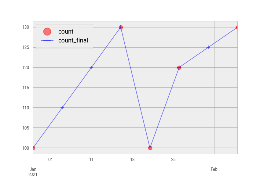
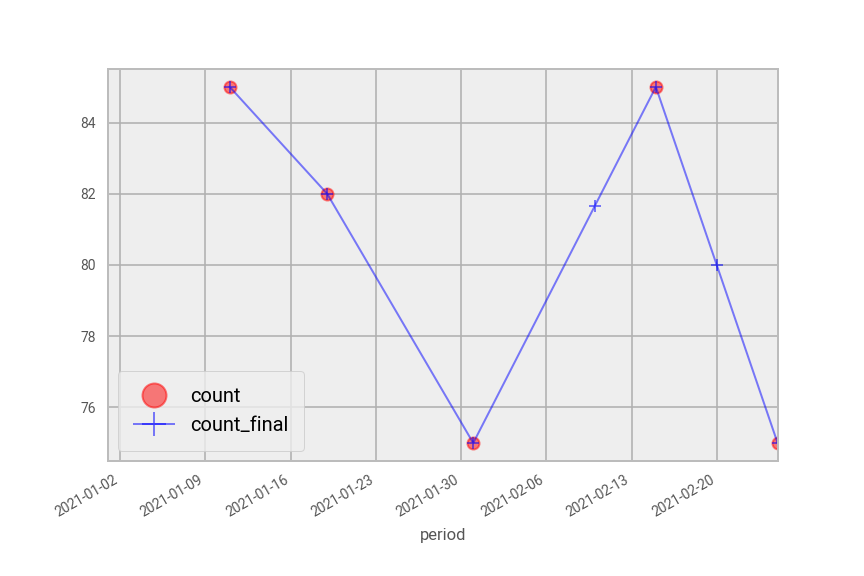
Fig. 44 Interpolated plot of pdf in Python split by area code “A” (top) and area code “B” (bottom).#
ggplot(df, mapping = aes(x = period, y = count_final)) +
  geom_point(aes(colour = factor(impute_flag))) +
  scale_fill_manual(values = c("red", "blue")) +
  geom_line() +
  labs(colour = "impute_flag") +
  facet_wrap(~area_code, nrow = 2)
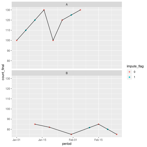
Fig. 45 Interpolated plot of df in R split by area code “A” (top) and area code “B” (bottom).#
Further resources#
Spark at the ONS articles:
Other resources:
This page has been adapted from another source. Note that the method shown in the linked page uses User Defined Functions (UDFs).
For more information about imputation, see the Awareness in Editing and Imputation course on the Learning Hub.
If your DataFrame is small enough just use pandas or R.
Wikipedia definition for interpolation