from afcharts.af_colours import get_af_colours
# Get the categorical palette hex codes
cat = get_af_colours("categorical")
# Get the sequential palette hex codes
seq = get_af_colours("sequential")1 Getting Started
This page will teach you how to install and use the afcharts python package to easily create accessible charts in the Analysis Function style.
Check out the rest of the cookbook for more detailed code examples and further guidance.
1.1 Installation
afcharts is available at the Python Package Index (PyPI). Python and pip are required for installation (see Installing Packages (python.org)). To install afcharts, open a terminal and execute:
pip install afchartsAlternatively, clone the Git repository and, from the root directory, install afcharts with pip or uv:
# with pip
pip install .
# with uv (creates a new virtual environment)
uv sync1.2 Colours
Use get_af_colours() to get a list of colours from any of the Analysis Function colour palettes. For example:
See the available colour palettes and more information on using afcharts colours in Colours.
Pass the list of colours to your plotting function as demonstrated in Matplotlib examples, Plotly examples and the examples below.
1.3 Matplotlib
afcharts includes a Matplotlib style sheet that automatically applies most of the formatting recommended by the Analysis Function guidance.
To apply the afcharts style to all Matplotlib plots:
import matplotlib.pyplot as plt

# Apply the afcharts style to all Matplotlib plots
plt.style.use('afcharts.afcharts')
To apply the afcharts style to a single Matplotlib plot:
import matplotlib.pyplot as plt

# Apply the afcharts style to the following plot only
with plt.style.context('afcharts.afcharts'):
    # <plotting code>
1.3.1 Example: Matplotlib line chart
This Matplotlib chart uses the afcharts style sheet and colour palettes to format the colours, fonts, axes and grid lines to match Analysis Function best practice.
See Matplotlib examples for many more examples.
Show the code
import pandas as pd
import matplotlib.pyplot as plt

from afcharts.af_colours import get_af_colours

# Get the categorical colour palette
categorical = get_af_colours("categorical")

# Load gapminder dataset from plotly
from plotly.express.data import gapminder

df = gapminder()
df = df[df["country"].isin(["Uruguay", "Cuba", "Venezuela", "Colombia", "Honduras"])]

# Apply the afcharts style sheet to all charts
plt.style.use("afcharts.afcharts")

fig = plt.figure(figsize = (8.5, 4.8))

for i, (country, data) in enumerate(df.groupby("country")):
    plt.plot(data["year"], data["lifeExp"], label=country, color=categorical[i])

plt.xlim([1950, 2010])
plt.ylim([0, 85])
plt.legend(
    loc="lower center",
    bbox_to_anchor=(0.5, -0.3),
    ncol=3
)

fig
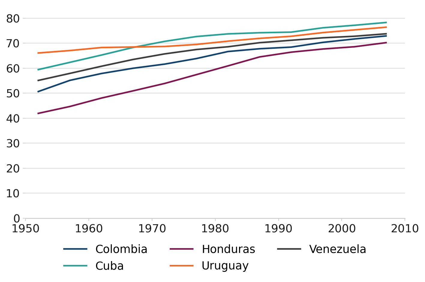
Living Longer
Life expectancy in South American countries, 1952 to 2007
Note: By default, Matplotlib will use colours from the categorical palette. For demonstration purposes, the example code explicitly passes the categorical colour palette to plt.plot().
1.4 Plotly
afcharts includes a Plotly template that automatically applies most of the formatting recommended by the Analysis Function guidance.
To apply the afcharts style to all Plotly plots:
# Import the afcharts template
from afcharts.pio_template import pio

# Apply the afcharts style to all Plotly plots
pio.templates.default = "afcharts"
To apply the afcharts style to a single Plotly graph object figure:
import plotly.graph_objects as go

# Import the afcharts template
import afcharts.pio_template

fig = go.Figure()

# Apply the afcharts style to this figure only
fig.update_layout(template="afcharts")
Or, for Plotly express functions, use the template argument. For example:
import plotly.express as px

# Import the afcharts template
import afcharts.pio_template

df = px.data.gapminder().query("year==2007")

fig = px.scatter(df, x="gdpPercap", y="lifeExp",
                 template="afcharts")
1.4.1 Example: Plotly line chart
This Plotly chart uses the afcharts template and colour palettes to format the colours, fonts, axes and grid lines to match Analysis Function best practice.
See Plotly examples for many more examples.
Show the code
import pandas as pd
import plotly.express as px
import plotly.graph_objects as go

from afcharts.pio_template import pio
from afcharts.af_colours import get_af_colours

# Set default theme
pio.templates.default = "afcharts"

# Get the categorical colour palette
categorical = get_af_colours("categorical")

# Load the gapminder dataset from plotly.express
df = px.data.gapminder()
df = df[df["country"].isin(["Uruguay", "Cuba", "Venezuela", "Colombia", "Honduras"])]

# Create figure
fig = go.Figure()

# Add a trace for each continent
for i, country in enumerate(df["country"].unique()):
    df_country = df[df["country"] == country]

    fig.add_trace(
        go.Scatter(
            x=df_country["year"],
            y=df_country["lifeExp"],
            mode="lines",
            name=country,
            text=df_country["country"],
            line=dict(color=categorical[i]),
        )
    )

# Update layout
fig.update_layout(
    xaxis=dict(
        showgrid=False,  # Hide x-axis grid lines
        dtick=10,  # Show ticks every 10 units
        tick0=1952,  # Make axis start at 1952
        range=[df["year"].min(), df["year"].max()],
    ),
    yaxis=dict(
        range=[0, 82],
        tickmode="linear",
        dtick=20,  # Show ticks every 20 units
    ),
    legend=dict(
        orientation="h",
        yanchor="top",
        y=-0.2,
        xanchor="center",
        x=0.5
    ),
    height=400,
    margin=dict(
        t=0,
        b=0,
        l=20,
        r=10
    ),
)

fig.show()
Living Longer
Life expectancy in South American countries, 1952 to 2007
Note: By default, Plotly will use colours from the categorical palette. For demonstration purposes, the example code explicitly passes the categorical colour palette to Plotly.