import matplotlib.pyplot as plt

# Load gapminder dataset from plotly
from plotly.express.data import gapminder

# Set default theme
plt.style.use("afcharts.afcharts")

df = gapminder().query("country == 'United Kingdom'")

# Make the figure wider than the default (6.4, 4.8)
fig = plt.figure(figsize=(8.5, 4.8))

plt.plot(df["year"], df["lifeExp"])

plt.xlim([1950, 2010])
plt.ylim([0, 82])

fig2 Using the package with matplotlib
2.1 Line charts
2.1.1 Single line chart
Living Longer
Life expectancy in the United Kingdom 1952 to 2007
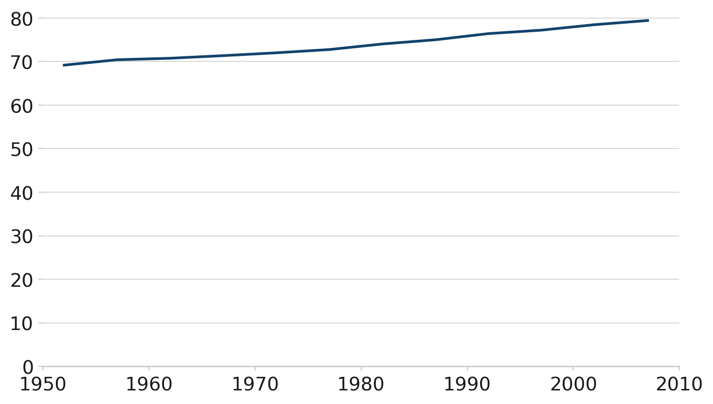
Source: Gapminder
This line chart uses the afcharts theme. There are pale grey grid lines extending from the y axis, and there is a thicker dark blue line representing the data.
2.1.2 Line chart with duo palette
import matplotlib.pyplot as plt

from afcharts.af_colours import get_af_colours

# Get the duo colour palette
duo = get_af_colours("duo")

# Load gapminder dataset from plotly
from plotly.express.data import gapminder

# Set default theme
plt.style.use("afcharts.afcharts")

df = gapminder()
df = df[df["country"].isin(["United Kingdom", "China"])]

# Make the figure wider than the default (6.4, 4.8)
fig, ax = plt.subplots(figsize=(8.5, 4.8))

for i, (country, data) in enumerate(df.groupby("country")):
    plt.plot(data["year"], data["lifeExp"], label=country, color=duo[i])
    ax.annotate(
        country,
        xy=(data["year"].values[-1], data["lifeExp"].values[-1]),
        xytext=(6,0),
        textcoords="offset points",
        bbox=dict(boxstyle="square", fc="white", lw=0)  # Add a white background
        )

plt.xlim([1950, 2010])
plt.ylim([0, 82])

fig
Living Longer
Life expectancy in the United Kingdom and China 1952 to 2007
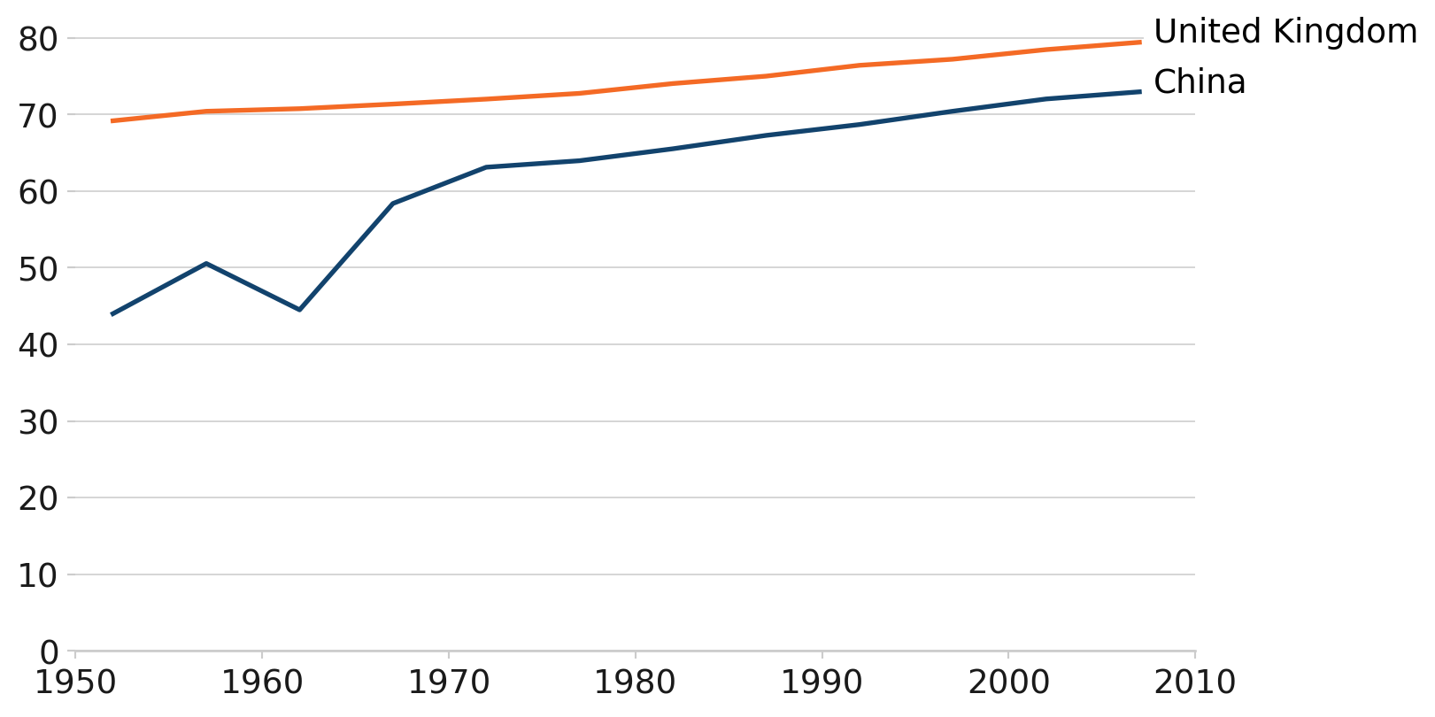
Source: Gapminder
This line chart uses the afcharts theme and there are thin pale grey lines extending from the y axis. There are two thicker lines showing the life expectancy in the UK and China over time. The line colours are from the main Analysis Function palette - dark blue for China and orange for the UK, denoted by a legend at the bottom of the chart.
2.2 Bar charts
import matplotlib.pyplot as plt

# Load gapminder dataset from plotly
from plotly.express.data import gapminder

# Set default theme
plt.style.use("afcharts.afcharts")

# Filter for Americas in 2007 and get top 5 by population
df = gapminder().query("year == 2007 & continent == 'Americas'")

top5 = df.nlargest(5, "pop")

fig = plt.figure()

plt.bar(
    top5["country"],
    top5["pop"] / 1e6,  # Convert to millions
)

fig
The U.S.A. is the most populous country in the Americas
Population of countries in the Americas (millions), 2007
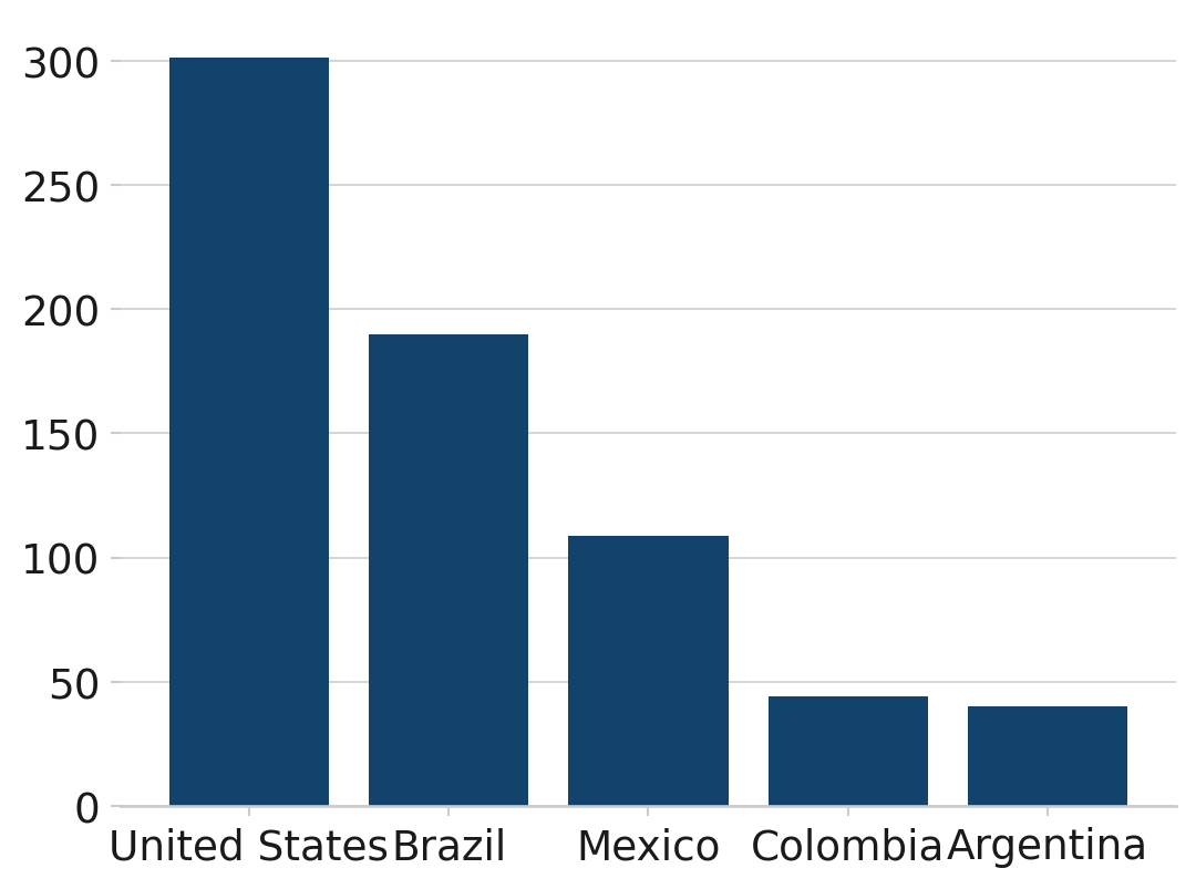
Source: Gapminder
This bar chart uses the afcharts theme, and shows the populations of the five most populous countries in the Americas. Each bar is dark blue and labelled by country underneath. All text is black in a sans serif font. Pale grey grid lines extend out from the y axis.
2.2.1 Grouped bar chart
import matplotlib.pyplot as plt
import numpy as np

# Load gapminder dataset from plotly
from plotly.express.data import gapminder

from afcharts.af_colours import get_af_colours

# Get the duo colour palette
duo = get_af_colours("duo")

# Set default theme
plt.style.use("afcharts.afcharts")

# Load gapminder data from plotly
df = gapminder().query("year in [1967, 2007] and country in ['United Kingdom', 'Ireland', 'France', 'Belgium']")

countries = ['United Kingdom', 'Ireland', 'France', 'Belgium']
years = [1967, 2007]
bar_width = 0.35
x = np.arange(len(countries))

fig = plt.figure()

for i, year in enumerate(years):
    data = df[df["year"] == year].set_index("country").reindex(countries)
    plt.bar(
        x + i * bar_width,
        data["lifeExp"],
        width=bar_width,
        label=str(year),
        color=duo[i]
    )
plt.xticks(x + bar_width / 2, countries)
plt.legend(
    loc="lower center",
    bbox_to_anchor=(0.5, -0.25),
    ncol=2
)

fig
Living longer
Life expectancy (years) in 1967 and 2007
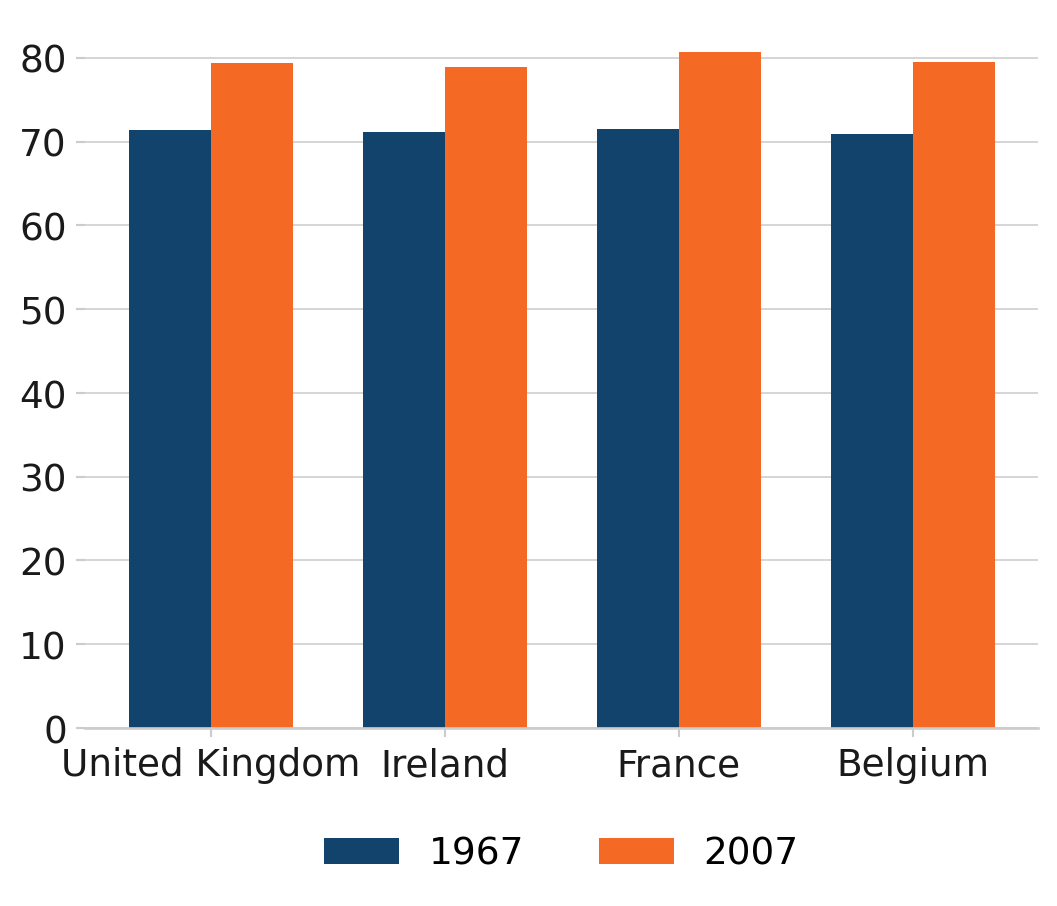
Source: Gapminder
This grouped bar chart uses the afcharts theme. It shows the life expectancy in 1967 and 2007 for four countries, which are displayed on the x axis. For each country there are two bars. The bar colours are from the main Analysis Function palette - dark blue for 1967 and orange for 2007, denoted by a legend at the bottom of the chart.
2.2.2 Stacked bar chart
Caution should be taken when producing stacked bar charts. They can quickly become difficult to interpret if plotting non part-to-whole data, and/or if plotting more than two categories per stack. First and last categories in the stack will always be easier to compare across bars than those in the middle. Think carefully about the story you are trying to tell with your chart.
import matplotlib.pyplot as plt
import matplotlib.ticker as mtick
import numpy as np

from pandas import cut
# Load gapminder dataset from plotly
from plotly.express.data import gapminder

from afcharts.af_colours import get_af_colours

# Get the duo colour palette
duo = get_af_colours("duo")

# Set default theme
plt.style.use("afcharts.afcharts")

# Load the gapminder dataset from plotly.express
df = gapminder().query("year == 2007")

# Create life expectancy groups
df['lifeExpGrouped'] = cut(
    df['lifeExp'],
    bins=[0, 75, float('inf')],
    labels=["Under 75", "75 and over"]
)

# Group by continent and life expectancy group
grouped = (
    df.groupby(["continent", "lifeExpGrouped"], observed=True)
    .size()
    .reset_index(name="n_countries")
)

# Pivot to get proportions
pivot_df = grouped.pivot(
    index="continent", columns="lifeExpGrouped", values="n_countries"
).fillna(0)
pivot_df["total"] = pivot_df.sum(axis=1)
pivot_df["percent of Under 75"] = pivot_df["Under 75"] / pivot_df["total"]
pivot_df["percent of 75 and over"] = pivot_df["75 and over"] / pivot_df["total"]

categories = ["Under 75", "75 and over"]

fig = plt.figure(figsize=(8, 5))

bottom = np.zeros(len(pivot_df))
for i, category in enumerate(categories):
    plt.bar(
        pivot_df.index,
        pivot_df[f"percent of {category}"],
        label=category,
        color=duo[i],
        bottom=bottom,
    )
    bottom += pivot_df[f"percent of {category}"]
# Set y axis to format as percent
plt.gca().yaxis.set_major_formatter(mtick.PercentFormatter(1))
plt.legend(loc="lower center", bbox_to_anchor=(0.5, -0.25), ncol=2)

fig
How life expectancy varies across continents
Percentage of countries by life expectancy band, 2007
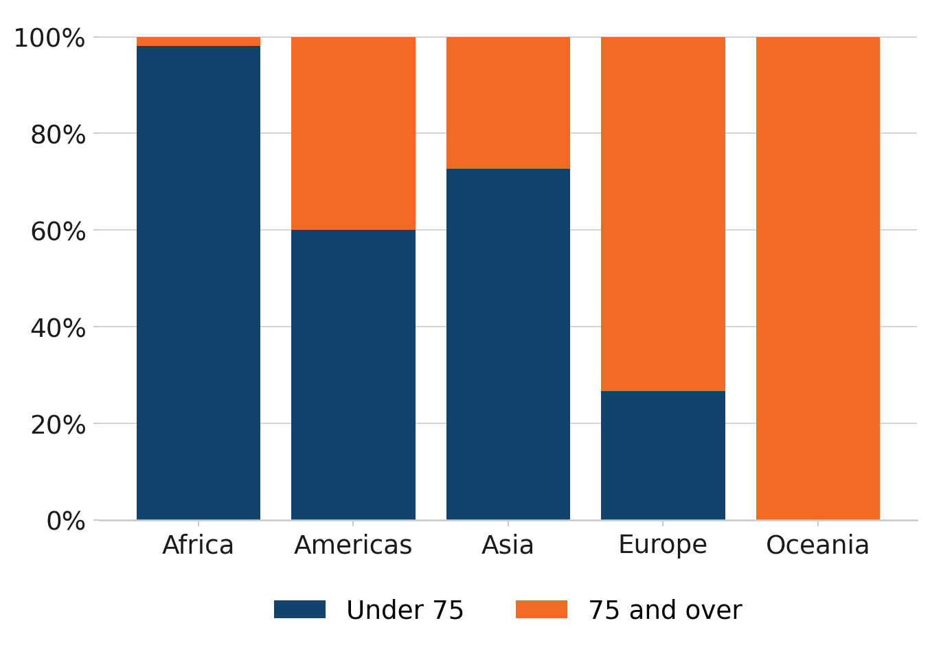
Source: Gapminder
This histogram uses the afcharts theme, and shows the distribution of life expectancy by number of countries. There are pale grey grid lines extending out from the y axis. The bars are dark blue with white space between each.
2.3 Scatterplots
import matplotlib.pyplot as plt
from matplotlib.ticker import StrMethodFormatter

# Load gapminder dataset from plotly
from plotly.express.data import gapminder

# Set default theme
plt.style.use("afcharts.afcharts")

# Load the gapminder dataset from plotly.express
df = gapminder().query("year == 2007")

# Make the figure wider than the default (6.4, 4.8)
fig = plt.figure(figsize=(8.5, 4.8))

plt.scatter(df["gdpPercap"], df["lifeExp"])

# Set axis limits to start at 0
plt.xlim(0, 5e4)
plt.ylim(0, max(df["lifeExp"]) + 5)
plt.xlabel("GDP per capita ($US, inflation-adjusted)")
plt.ylabel("Life Expectancy (years)")

# Format x-axis with commas
plt.gca().xaxis.set_major_formatter(StrMethodFormatter("{x:,.0f}"))

# Add vertical gridlines
plt.grid(True)

fig
The relationship between GDP and Life Expectancy is complex
GDP and Life Expectancy for all countries, 2007
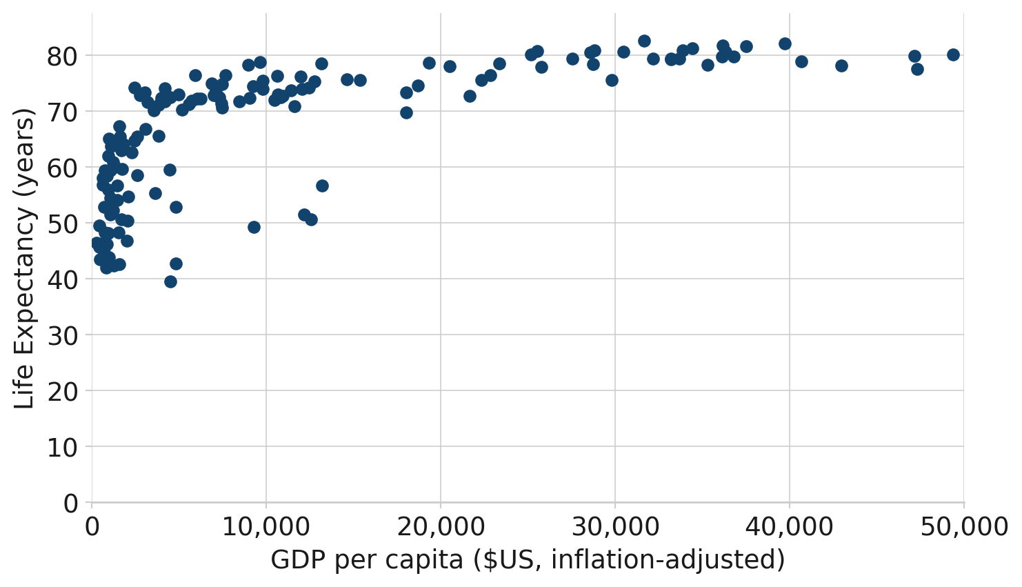
Source: Gapminder
This scatterplot uses the afcharts theme, and shows life expectancy against GDP per capita for 142 countries in 2007. Thin pale grey lines extend out from the x and y axis labels, forming a grid. The data points are plotted as dark blue circles. Both axes are labeled in black using a sans serif font.
2.4 Small multiples
import matplotlib.pyplot as plt
from matplotlib.ticker import FuncFormatter

# Load gapminder dataset from plotly
from plotly.express.data import gapminder

from afcharts.af_colours import get_af_colours

# Get the categorical colour palette
categorical = get_af_colours("categorical")

# Set default theme
plt.style.use("afcharts.afcharts")

df = gapminder()

# Filter out Oceania and aggregate population by continent and year
df_grouped = (
    df[df["continent"] != "Oceania"]
    .groupby(["continent", "year"], observed=True)["pop"]
    .sum()
    .reset_index()
)

# Define the continents to plot
continents = df_grouped["continent"].unique()

# Create a 2x2 subplot layout
fig, axes = plt.subplots(
    ncols=2, nrows=2, sharex=True, sharey=True, constrained_layout=True
)


# Make custom formatter for tick labels
def tick_billions(x, pos):
    if x == 0:
        return "0"
    else:
        return f"{x / 1e9:.0f}bn"


# Add data to each set of axes
for idx, (continent, ax) in enumerate(zip(continents, axes.flat)):
    data = df_grouped[df_grouped["continent"] == continent]
    ax.fill_between(x=data["year"], y1=data["pop"], y2=0, color=categorical[idx])
    ax.yaxis.set_major_formatter(FuncFormatter(tick_billions))
    ax.set_title(continent, loc="center")

fig
Asia’s rapid growth
Population growth by continent, 1952-2007
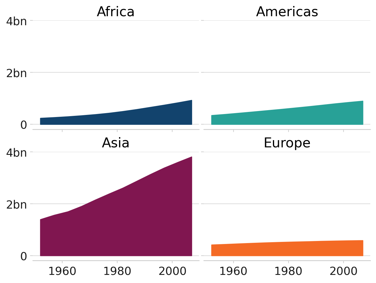
Source: Gapminder
This chart uses the afcharts theme. It contains four subplots in a two by two grid showing how the populations of four continents have changed over time. Each subplot is labelled with the continent. The subplots have a common y axis, with no values on the x axis to facilitate for a simple comparison of the relative values. Each subplot is filled with a different colour from the Analysis Function categorical colour palette to be distinct from other subplots.
2.5 Pie charts
import matplotlib.pyplot as plt
from matplotlib.ticker import FuncFormatter
from pandas import cut

# Load gapminder dataset from plotly
from plotly.express.data import gapminder

from afcharts.af_colours import get_af_colours

# Get the duo colour palette
duo = get_af_colours("duo")

# Set default theme
plt.style.use("afcharts.afcharts")

df = gapminder().query("continent == 'Europe' and year == 2007")

# Create life expectancy groups
df['lifeExpGrouped'] = cut(
    df['lifeExp'],
    bins=[0, 75, float('inf')],
    labels=["Under 75", "75 and over"]
)

# Count number of countries in each group
group_counts = df["lifeExpGrouped"].value_counts().sort_index()

fig = plt.figure()
patches, labels, texts = plt.pie(
    group_counts.values,
    labels=group_counts.index,
    autopct="%1.0f%%",
    colors=duo,
    wedgeprops={"edgecolor": "white", "linewidth": 2},
)

textcolours = ["white", "black"]

# Set the text to contrasting colours
for i, text in enumerate(texts):
    text.set_color(textcolours[i])

fig
How life expectancy varies in Europe
Percentage of countries by life expectancy band, 2007
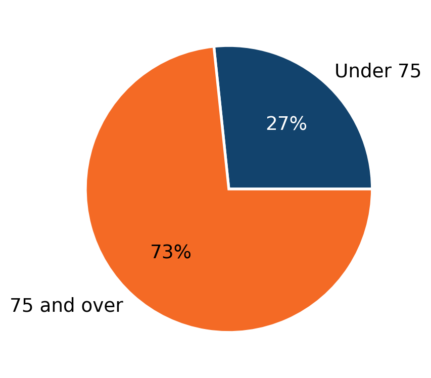
Source: Gapminder
This pie chart uses the afcharts theme, showing the proportions of European countries with a life expectancy under and over 75. The segment colours are from the Analysis Function categorical palette, with the smaller under 75 segment in dark blue, and the larger over 75 segment in orange. This is indicated by labels next to each segment. There is whitespace separating the segments from each other.
2.6 Focus charts
import matplotlib.pyplot as plt
from matplotlib.ticker import FuncFormatter

# Load gapminder dataset from plotly
from plotly.express.data import gapminder

from afcharts.af_colours import get_af_colours

# Get the focus colour palette
focus = get_af_colours("focus")

# Set default theme
plt.style.use("afcharts.afcharts")

df = gapminder().query("year == 2007 & continent == 'Americas'")

top5 = df.nlargest(5, "pop")

colours = {
    country: focus[0 if country == "Brazil" else 1]
    for country in top5["country"].unique()
}

fig = plt.figure(figsize=(8, 5))
plt.bar(
    top5["country"],
    top5["pop"] / 1e6,
    color=[colours[country] for country in top5["country"]],
)

fig
Brazil has the second highest population in the Americas
Population of countries in the Americas (millions), 2007
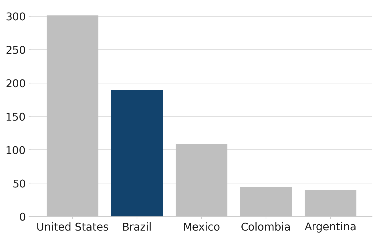
Source: Gapminder
This bar chart uses the afcharts theme, and shows the populations of five countries of the Americas in descending order. The country names are given on the x axis, with all chart text in black in a sans serif font. Four of the bars on the chart are light grey, and the bar for Brazil is filled in dark blue to highlight it.