import matplotlib.pyplot as plt

# Set default theme
plt.style.use("afcharts.afcharts")

# Load the gapminder dataset from plotly.express
from plotly.express.data import gapminder

df = gapminder().query("country == 'United Kingdom'")

# Make the figure wider than the default (6.4, 4.8)
fig = plt.figure(figsize=(8.5, 4.8))

plt.plot(df["year"], df["lifeExp"])

plt.xlim([1950, 2010])
plt.ylim([0, 82])

fig2 Using the package with matplotlib
2.1 Line charts
2.1.1 Single line chart
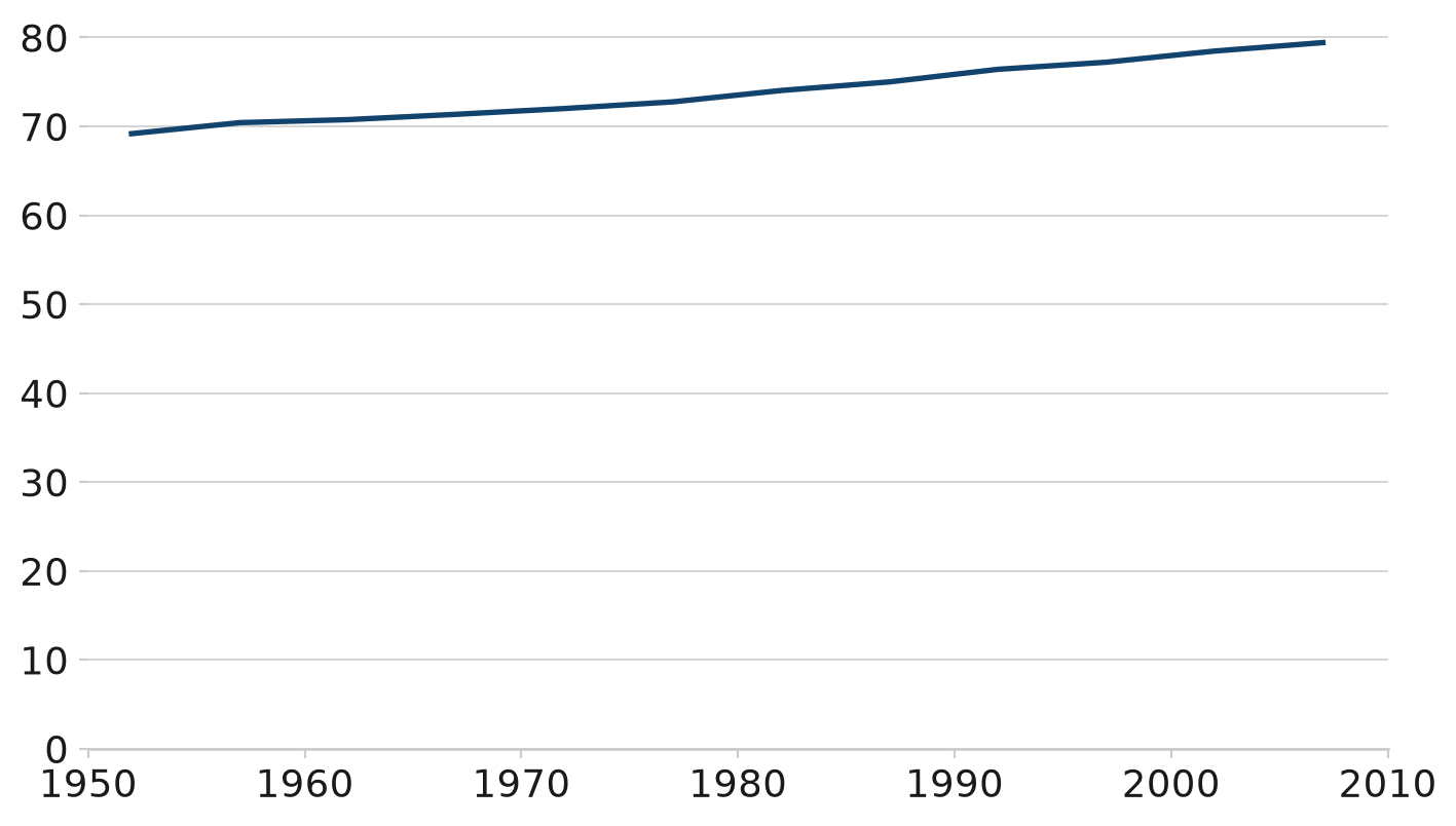
Living Longer
Life expectancy in the United Kingdom 1952 to 2007
Source: Gapminder
This line chart uses the afcharts theme. There are pale grey grid lines extending from the y axis, and there is a thicker dark blue line representing the data.
2.1.2 Line chart with duo palette
import matplotlib.pyplot as plt

from afcharts.af_colours import get_af_colours

# Get the duo colour palette
duo = get_af_colours("duo")

# Set default theme
plt.style.use("afcharts.afcharts")

# Load the gapminder dataset from plotly.express
from plotly.express.data import gapminder

df = gapminder()
df = df[df["country"].isin(["United Kingdom", "China"])]

# Make the figure wider than the default (6.4, 4.8)
fig, ax = plt.subplots(figsize=(8.5, 4.8))

for i, (country, data) in enumerate(df.groupby("country")):
    plt.plot(data["year"], data["lifeExp"], label=country, color=duo[i])
    ax.annotate(
        country,
        xy=(data["year"].values[-1], data["lifeExp"].values[-1]),
        xytext=(6, 0),
        textcoords="offset points",
        bbox=dict(boxstyle="square", fc="white", lw=0),  # Add a white background
    )

plt.xlim([1950, 2010])
plt.ylim([0, 82])

fig
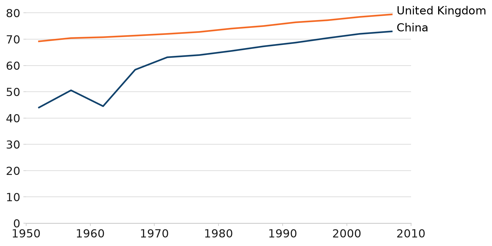
Living Longer
Life expectancy in the United Kingdom and China 1952 to 2007
Source: Gapminder
This line chart uses the afcharts theme and there are thin pale grey lines extending from the y axis. There are two thicker lines showing the life expectancy in the UK and China over time. The line colours are from the Analysis Function ‘duo’ palette - dark blue for China and orange for the UK, denoted by a legend at the bottom of the chart.
2.2 Bar charts
import matplotlib.pyplot as plt

# Set default theme
plt.style.use("afcharts.afcharts")

# Load the gapminder dataset from plotly.express
from plotly.express.data import gapminder

# Filter for Americas in 2007 and get top 5 by population
df = gapminder().query("year == 2007 & continent == 'Americas'")

top5 = df.nlargest(5, "pop")

fig = plt.figure()

plt.bar(
    top5["country"],
    top5["pop"] / 1e6,  # Convert to millions
)

fig
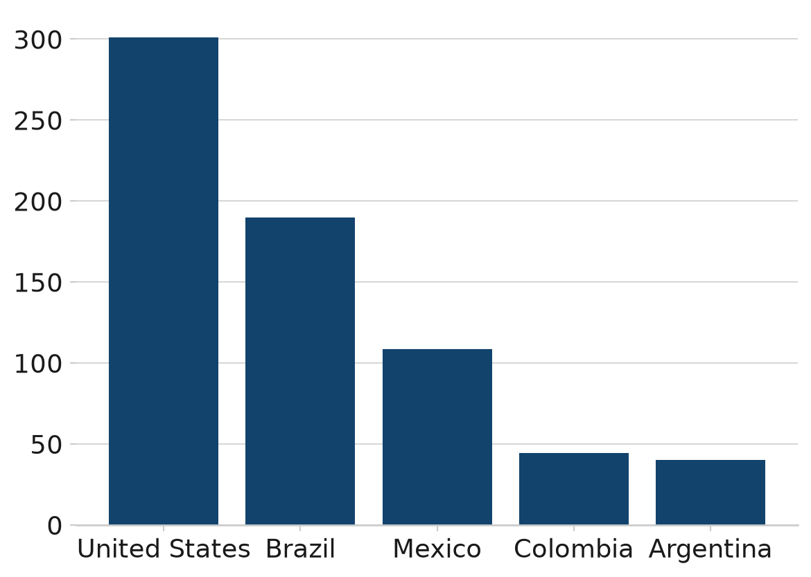
The U.S.A. is the most populous country in the Americas
Population of countries in the Americas (millions), 2007
Source: Gapminder
This bar chart uses the afcharts theme, and shows the populations of the five most populous countries in the Americas. Each bar is dark blue and labelled by country underneath. All text is black in a sans serif font. Pale grey grid lines extend out from the y axis.
2.2.1 Grouped bar chart
import matplotlib.pyplot as plt
import numpy as np

from afcharts.af_colours import get_af_colours

# Set default theme
plt.style.use("afcharts.afcharts")

# Get the duo colour palette
duo = get_af_colours("duo")

# Load the gapminder dataset from plotly.express
from plotly.express.data import gapminder

df = gapminder().query(
    "year in [1967, 2007] & country in ['United Kingdom', 'Ireland', 'France', 'Belgium']"
)

countries = ["United Kingdom", "Ireland", "France", "Belgium"]
years = [1967, 2007]
bar_width = 0.35
x = np.arange(len(countries))

fig = plt.figure()

for i, year in enumerate(sorted(df["year"].unique())):
    df_year = df[df["year"] == year].set_index("country").reindex(countries)
    plt.bar(
        x + i * bar_width,
        df_year["lifeExp"],
        width=bar_width,
        label=str(year),
        color=duo[i % len(duo)]
    )
plt.xticks(x + bar_width / 2, countries)
plt.legend(
    loc="lower center",
    bbox_to_anchor=(0.5, -0.25),
    ncol=2
)
fig
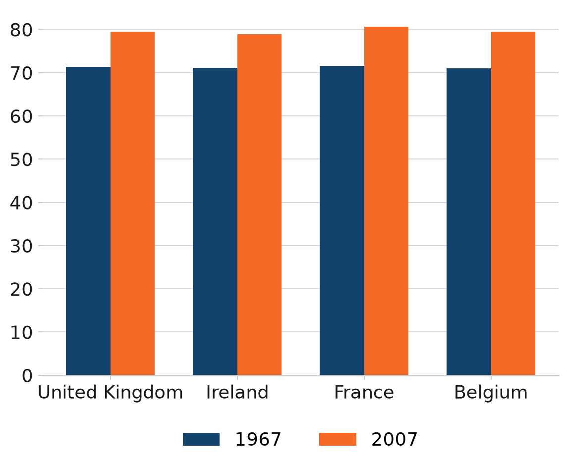
Living longer
Life expectancy (years) in 1967 and 2007
Source: Gapminder
This grouped bar chart uses the afcharts theme. It shows the life expectancy in 1967 and 2007 for four countries, which are displayed on the x axis. For each country there are two bars. The bar colours are from the Analysis Function ‘duo’ palette - dark blue for 1967 and orange for 2007, denoted by a legend at the bottom of the chart.
2.2.2 Stacked bar chart
Caution should be taken when producing stacked bar charts. They can quickly become difficult to interpret if plotting non part-to-whole data, and/or if plotting more than two categories per stack. First and last categories in the stack will always be easier to compare across bars than those in the middle. Think carefully about the story you are trying to tell with your chart.
import pandas as pd
import matplotlib.pyplot as plt
import matplotlib.ticker as mtick
import numpy as np

from afcharts.af_colours import get_af_colours

# Get the duo colour palette
duo = get_af_colours("duo")

# Set default theme
plt.style.use("afcharts.afcharts")

# Load the gapminder dataset from plotly.express
from plotly.express.data import gapminder

df = gapminder().query("year == 2007")

# Create life expectancy groups
df["lifeExpGrouped"] = pd.cut(
    df["lifeExp"],
    bins=[0, 75, float("inf")],
    labels=["Under 75", "75 and over"]
)

# Group by continent and life expectancy group
grouped = (
    df.groupby(["continent", "lifeExpGrouped"], observed=True)
    .size()
    .reset_index(name="n_countries")
)

# Pivot to get proportions
pivot_df = grouped.pivot(
    index="continent", columns="lifeExpGrouped", values="n_countries"
).fillna(0)
pivot_df["total"] = pivot_df.sum(axis=1)
pivot_df["percent of Under 75"] = pivot_df["Under 75"] / pivot_df["total"]
pivot_df["percent of 75 and over"] = pivot_df["75 and over"] / pivot_df["total"]

categories = ["Under 75", "75 and over"]

fig = plt.figure(figsize=(8, 5))

bottom = np.zeros(len(pivot_df))
for i, category in enumerate(categories):
    percent_col = f"percent of {category}"
    life_exp_data = pivot_df[[percent_col]]

    plt.bar(
        life_exp_data.index,
        life_exp_data[percent_col],
        label=str(category),
        color=duo[i % len(duo)],
        bottom=bottom,
    )
    bottom += pivot_df[f"percent of {category}"]
# Set y axis to format as percent
plt.gca().yaxis.set_major_formatter(mtick.PercentFormatter(1))
plt.legend(loc="lower center", bbox_to_anchor=(0.5, -0.25), ncol=2)

fig
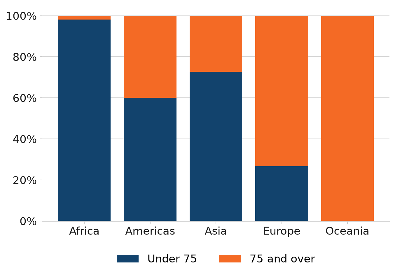
How life expectancy varies across continents
Percentage of countries by life expectancy band, 2007
Source: Gapminder
This stacked bar chart uses the afcharts theme and shows the proportions of countries with a life expectancy over and under 75 by continent. The continents are listed along the x axis, with the y axis labelled between 0% and 100%. The colours for the bar segments are from the Analysis Function ‘duo’ palette - dark blue for under 75 and orange for over 75, denoted by a legend at the bottom of the chart. There is whitespace between each bar.
2.3 Histograms
import matplotlib.pyplot as plt

# Set default theme
plt.style.use("afcharts.afcharts")

# Load the gapminder dataset from plotly.express
from plotly.express.data import gapminder

# Filter for year 2007
df = gapminder().query("year == 2007")

fig = plt.figure()

plt.hist(
    df["lifeExp"],
    bins=range(int(df["lifeExp"].min()), int(df["lifeExp"].max()) + 5, 5),
    edgecolor="white"
)

plt.ylabel("Number of\n countries", rotation=0, labelpad=40)

fig
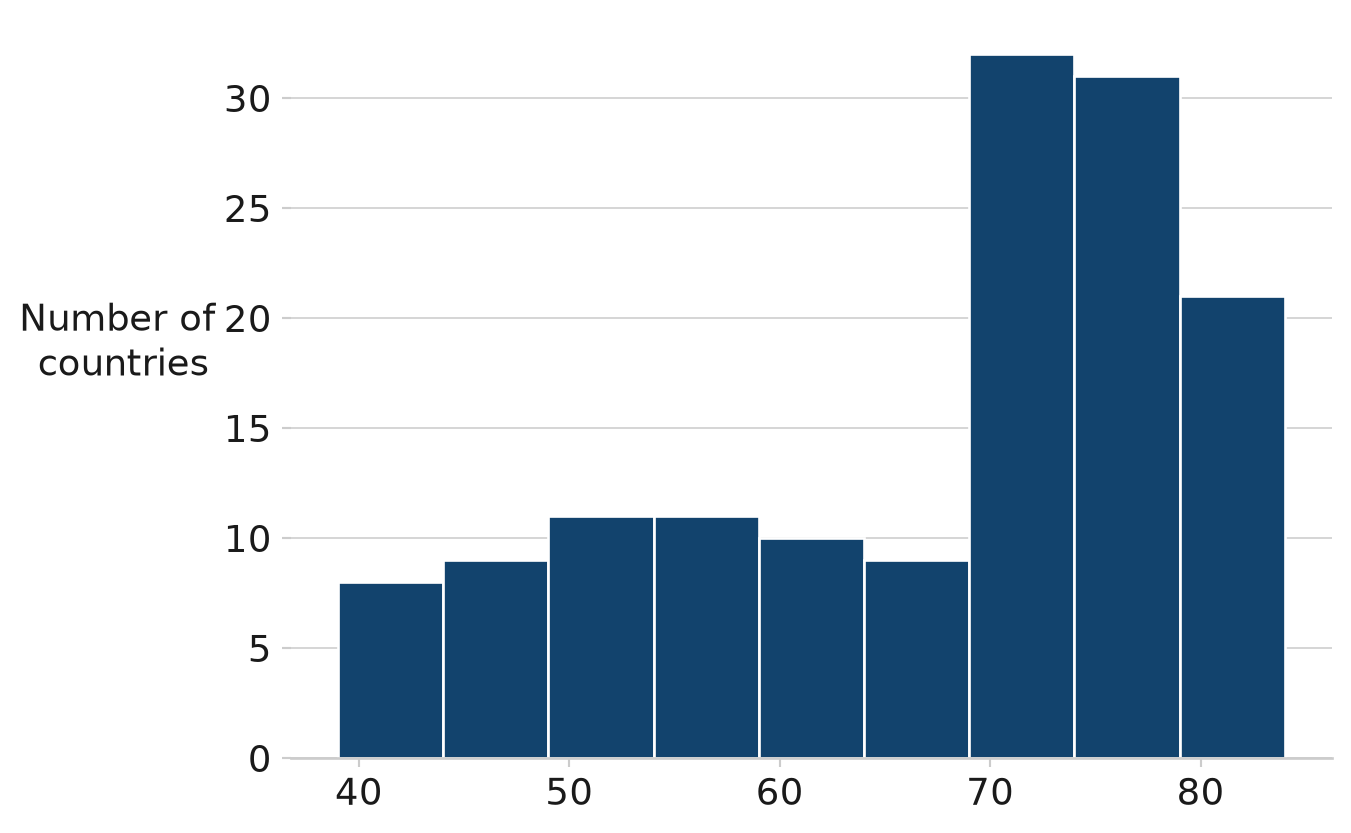
How life expectancy varies
Distribution of life expectancy, 2007
Source: Gapminder
This histogram uses the afcharts theme, and shows the distribution of life expectancy across countries in 2007. The x-axis shows life expectancy in 5-year bins, and the y-axis shows the number of countries. The bars are dark blue with white edges separating each bin. Pale grey grid lines extend out from the y-axis.
2.4 Scatterplots
import matplotlib.pyplot as plt
from matplotlib.ticker import StrMethodFormatter

# Set default theme
plt.style.use("afcharts.afcharts")

# Load the gapminder dataset from plotly.express
from plotly.express.data import gapminder

df = gapminder().query("year == 2007")

# Make the figure wider than the default (6.4, 4.8)
fig = plt.figure(figsize=(8.5, 4.8))

plt.scatter(df["gdpPercap"], df["lifeExp"])

# Axes should start from 0
plt.xlim(0, 5e4)
plt.ylim(0, max(df["lifeExp"]) + 5)
plt.xlabel("GDP per capita ($US, inflation-adjusted)")
plt.ylabel("Life Expectancy (years)")

# Format x-axis with commas
plt.gca().xaxis.set_major_formatter(StrMethodFormatter("{x:,.0f}"))

# Add vertical gridlines
plt.grid(True)

fig
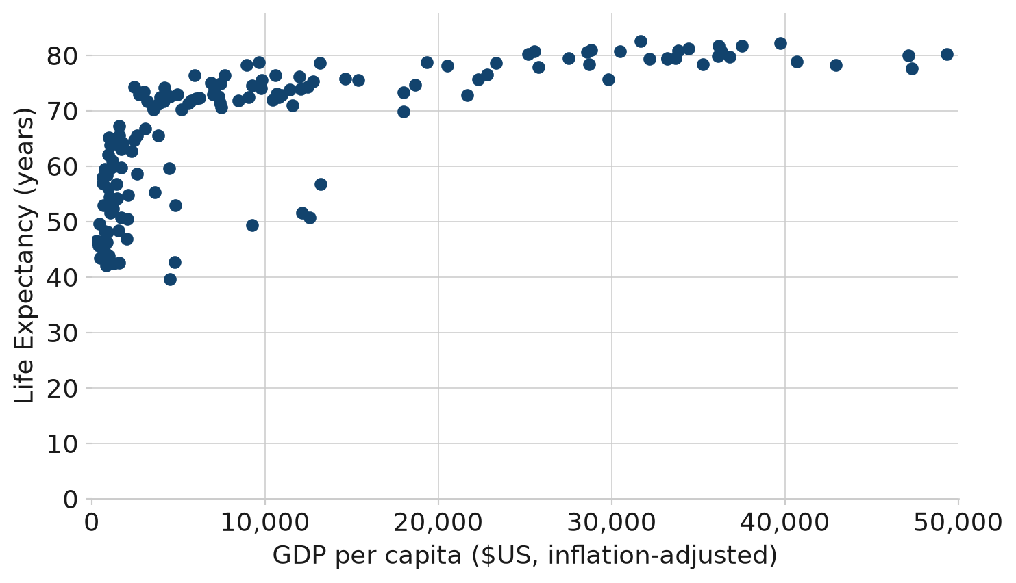
The relationship between GDP and Life Expectancy is complex
GDP and Life Expectancy for all countries, 2007
Source: Gapminder
This scatterplot uses the afcharts theme, and shows life expectancy against GDP per capita for 142 countries in 2007. Thin pale grey lines extend out from the x and y axis labels, forming a grid. The data points are plotted as dark blue circles. Both axes are labeled in black using a sans serif font.
2.5 Small multiples
import matplotlib.pyplot as plt
from matplotlib.ticker import FuncFormatter

from afcharts.af_colours import get_af_colours

# Get the categorical colour palette
categorical = get_af_colours("categorical")

# Set default theme
plt.style.use("afcharts.afcharts")

# Load the gapminder dataset from plotly.express
from plotly.express.data import gapminder

df = gapminder()

# Filter out Oceania and aggregate population by continent and year
df_grouped = (
    df[df["continent"] != "Oceania"]
    .groupby(["continent", "year"], observed=True)["pop"].sum()
    .reset_index()
)

# Define the continents to plot
continents = df_grouped["continent"].unique()

# Create a 2x2 subplot layout
fig, axes = plt.subplots(
    ncols=2, nrows=2, sharex=True, sharey=True, constrained_layout=True
)

# Make custom formatter for tick labels
def tick_billions(x, pos):
    if x == 0:
        return "0"
    else:
        return f"{x / 1e9:.0f}bn"


# Add data to each set of axes
for idx, (continent, ax) in enumerate(zip(continents, axes.flat)):
    data = df_grouped[df_grouped["continent"] == continent]
    ax.fill_between(x=data["year"], y1=data["pop"], y2=0, color=categorical[idx])
    ax.yaxis.set_major_formatter(FuncFormatter(tick_billions))
    ax.set_title(continent, loc="center")

fig
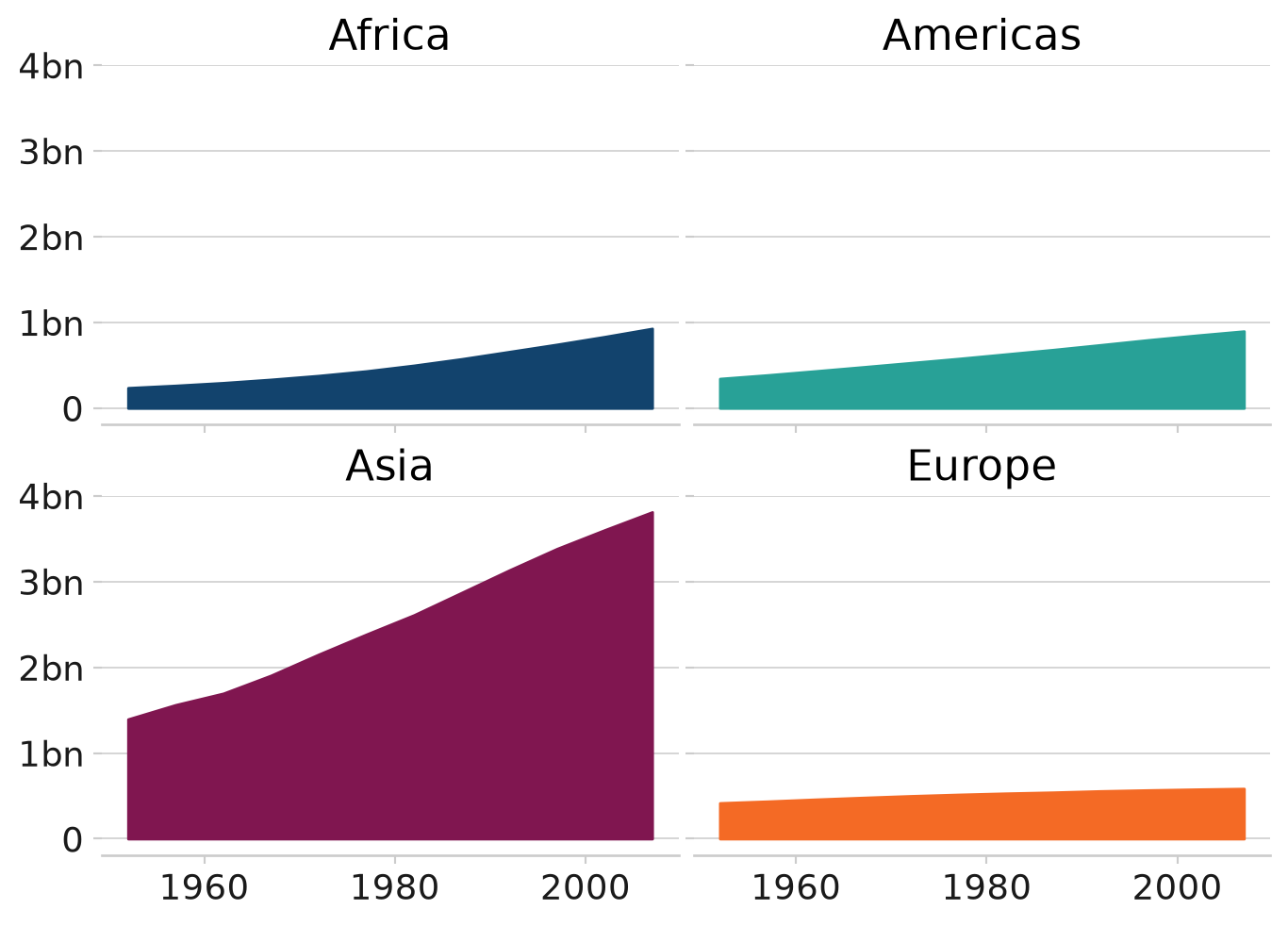
Asia’s rapid growth
Population growth by continent, 1952-2007
Source: Gapminder
This chart uses the afcharts theme. It contains four subplots in a two by two grid showing how the populations of four continents have changed over time. Each subplot is labelled with the continent. The subplots have a common y axis, with no values on the x axis to facilitate for a simple comparison of the relative values. Each subplot is filled with a different colour from the Analysis Function categorical colour palette to be distinct from other subplots.
2.6 Pie charts
import pandas as pd
import matplotlib.pyplot as plt
from matplotlib.ticker import FuncFormatter

from afcharts.af_colours import get_af_colours

# Get the duo colour palette
duo = get_af_colours("duo")

# Set default theme
plt.style.use("afcharts.afcharts")

# Load the gapminder dataset from plotly.express
from plotly.express.data import gapminder

df = gapminder().query("continent == 'Europe' and year == 2007")

# Create life expectancy groups
df["lifeExpGrouped"] = pd.cut(
    df["lifeExp"],
    bins=[0, 75, float("inf")],
    labels=["Under 75", "75 and over"]
)

# Count number of countries in each group
group_counts = df["lifeExpGrouped"].value_counts().sort_index()

fig = plt.figure()
patches, labels, texts = plt.pie(
    group_counts.values,
    labels=group_counts.index,
    autopct="%1.0f%%",
    colors=duo,
    wedgeprops={"edgecolor": "white", "linewidth": 2},
)

textcolours = ["white", "black"]

# Set the text to contrasting colours
for i, text in enumerate(texts):
    text.set_color(textcolours[i])

fig
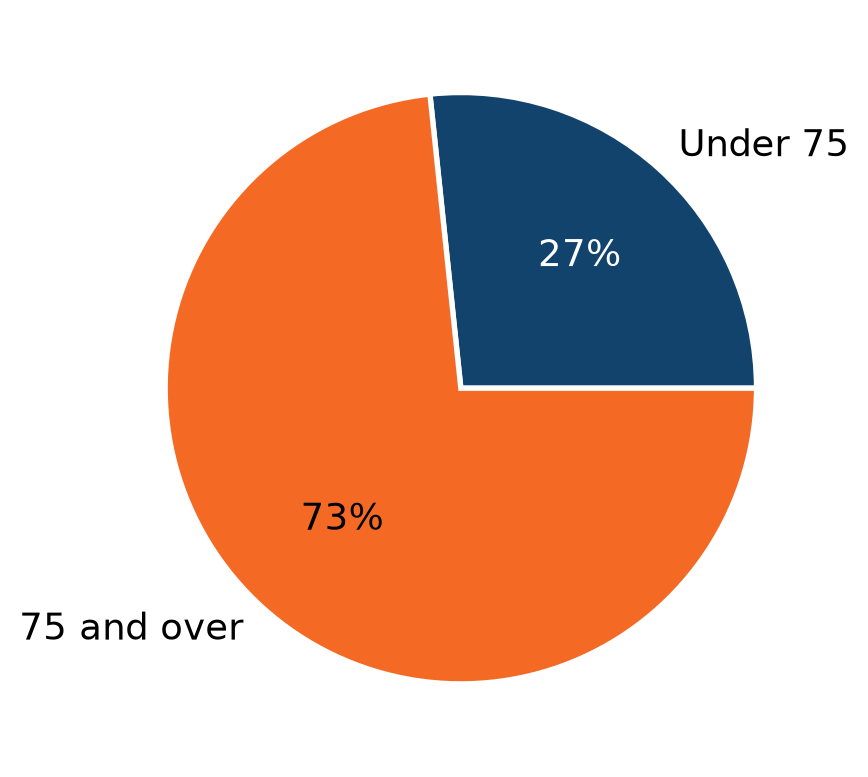
How life expectancy varies in Europe
Percentage of countries by life expectancy band, 2007
Source: Gapminder
This pie chart uses the afcharts theme, showing the proportions of European countries with a life expectancy under and over 75. The segment colours are from the Analysis Function categorical palette, with the smaller under 75 segment in dark blue, and the larger over 75 segment in orange. This is indicated by labels next to each segment. There is whitespace separating the segments from each other.
2.7 Focus charts
import matplotlib.pyplot as plt
from matplotlib.ticker import FuncFormatter

from afcharts.af_colours import get_af_colours

# Get the focus colour palette
focus = get_af_colours("focus")

# Set default theme
plt.style.use("afcharts.afcharts")

# Load the gapminder dataset from plotly.express
from plotly.express.data import gapminder

df = gapminder().query("year == 2007 & continent == 'Americas'")

top5 = df.nlargest(5, "pop")

colours = {
    country: focus[0 if country == "Brazil" else 1]
    for country in top5["country"].unique()
}

# Map colors to bar order
bar_colours = [colours[country] for country in top5["country"]]

fig = plt.figure(figsize=(8, 5))

plt.bar(
    top5["country"],
    top5["pop"] / 1e6,
    color=bar_colours,
)

fig
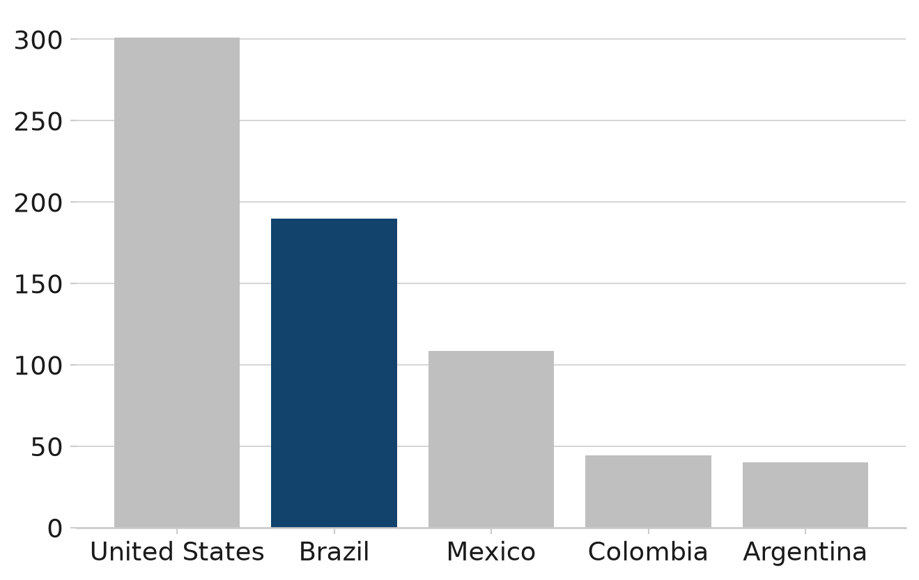
Brazil has the second highest population in the Americas
Population of countries in the Americas (millions), 2007
Source: Gapminder
This bar chart uses the afcharts theme, and shows the populations of five countries of the Americas in descending order. The country names are given on the x axis, with all chart text in black in a sans serif font. Four of the bars on the chart are light grey, and the bar for Brazil is filled in dark blue to highlight it.
2.8 Choropleth maps
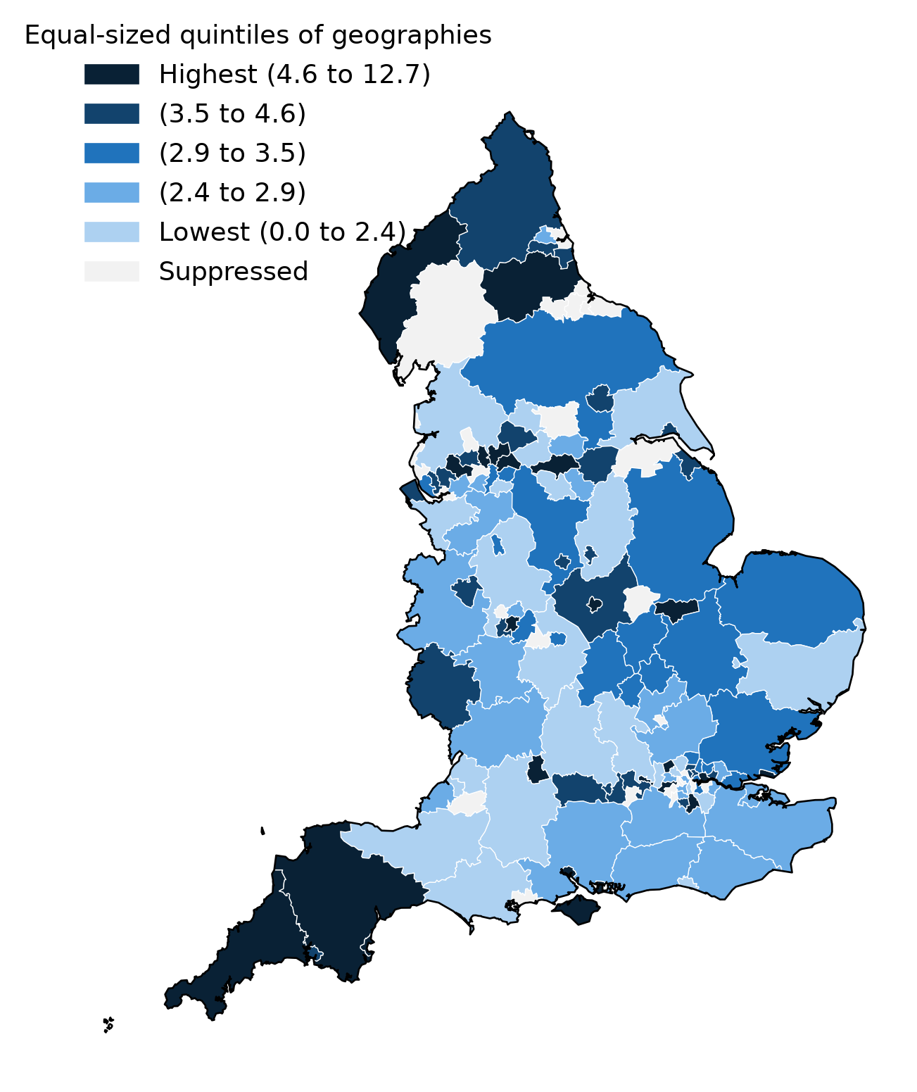
A choropleth map colours geographic areas according to a data value. In this example, we plot rates of visual impairment certification across upper-tier local authority areas in England. Each area is assigned to one of five equal groups (quintiles) and coloured from lightest to darkest to represent low to high rates.
This example introduces two concepts not seen in the earlier chart examples:
- Sequential colour palette: Unlike the categorical or duo palettes used in earlier examples, the sequential palette is designed for ordered data, where colour intensity conveys magnitude — light shades for low values, dark shades for high values.
- GeoPandas: A library that extends Pandas to work with geospatial data. Here it is used to load geographic boundary files (in GeoJSON format), clip them to England only, and merge them with the health indicator data — creating a single dataset that Plotly can use to draw the map.
import requests
import pandas as pd
import io
import geopandas as gpd
import matplotlib.pyplot as plt
from afcharts.af_colours import get_af_colours
from matplotlib.patches import Patch

# Fetch indicator data
url = "https://fingertips.phe.org.uk/api/all_data/csv/by_indicator_id?indicator_ids=41203"
df = pd.read_csv(io.BytesIO(requests.get(url, verify=False).content))

df = df[df["Time period"] == "2023/24"]

# Numeric breakpoints for quantiles
bins = [0, 2.4, 2.9, 3.5, 4.6, 12.7]

# Create labels for the quantiles, with a label for suppressed values
labels = ["Suppressed", "Lowest (0.0 to 2.4)", "(2.4 to 2.9)", "(2.9 to 3.5)", "(3.5 to 4.6)", "Highest (4.6 to 12.7)"]

# Assign bin categories
df["quantile_label"] = (
    pd.cut(df["Value"], bins=bins, labels=labels[1:], include_lowest=True)
    .cat.add_categories("Suppressed")
    .fillna("Suppressed")
)

# Load UK Country boundaries using geopandas
url = (
    "https://services1.arcgis.com/ESMARspQHYMw9BZ9/arcgis/rest/services/"
    "Countries_December_2023_Boundaries_UK_BUC/FeatureServer/0/query"
    "?outFields=*&where=1%3D1&f=geojson"
)
country_boundaries = gpd.read_file(requests.get(url, verify=False).content).to_crs(4326)

# Load Counties and Unitary Authorities boundaries using geopandas
url = "https://services1.arcgis.com/ESMARspQHYMw9BZ9/arcgis/rest/services/Counties_and_Unitary_Authorities_December_2023_Boundaries_UK_BUC/FeatureServer/0/query?outFields=*&where=1%3D1&f=geojson"
gdf = gpd.read_file(requests.get(url, verify=False).content).to_crs(4326)

# Filter boundaries to England only
england_boundaries = country_boundaries[country_boundaries["CTRY23NM"] == "England"]
gdf_clipped_strict = gpd.overlay(gdf, england_boundaries, how="intersection")

# Merge the indicator data with the geographic boundaries
merged = gdf_clipped_strict.merge(df, left_on="CTYUA23CD", right_on="Area Code", how="left").reset_index(drop=True)

# Get the sequential colour palette in reverse order
sequential = get_af_colours("sequential", number_of_colours=5, include_grey=True)[::-1]

# Set default theme
plt.style.use("afcharts.afcharts")

colour_map = dict(zip(labels, sequential))
merged["colour"] = merged["quantile_label"].map(colour_map).fillna(sequential[0])

fig, ax = plt.subplots(figsize=(8, 10))

# Plot a choropleth map using the .plot() method of our geopandas dataframe
merged.plot(ax=ax, color=merged["colour"], edgecolor="white", linewidth=0.5)

# Add outline of England
england_boundaries.plot(ax=ax, color="none", edgecolor="black", linewidth=1)

# Add a legend entry for each category
legend_patches = [
    Patch(color=colour, label=label)
    for label, colour in zip(labels, sequential)
]

ax.legend(
    handles=legend_patches[::-1],
    loc="upper left",
    borderaxespad=-2, # to achieve acceptable spacing between legend and map
    title="Equal-sized quintiles of geographies",
    fontsize=14
)

ax.axis("off")

fig
Choropleth map with five series of sequential data
Rate of new certifications of visual impairment due to diabetic eye disease in persons aged 12 years and over, per 100,000 population
Source: Data used to create this map is available to download from the Fingertips Local Authority Health Profiles produced by the Office for Health Improvement and Disparities.
The map shows the rate of new certifications of visual impairment (CVI) due to diabetic eye disease in persons aged 12 years and over by upper-tier local authority. The data has been broken down into five equal groups with the highest fifth of areas being in the category showing as darkest blue on the map, and areas with the lowest levels shown in the lightest blue.
2.9 Heatmaps
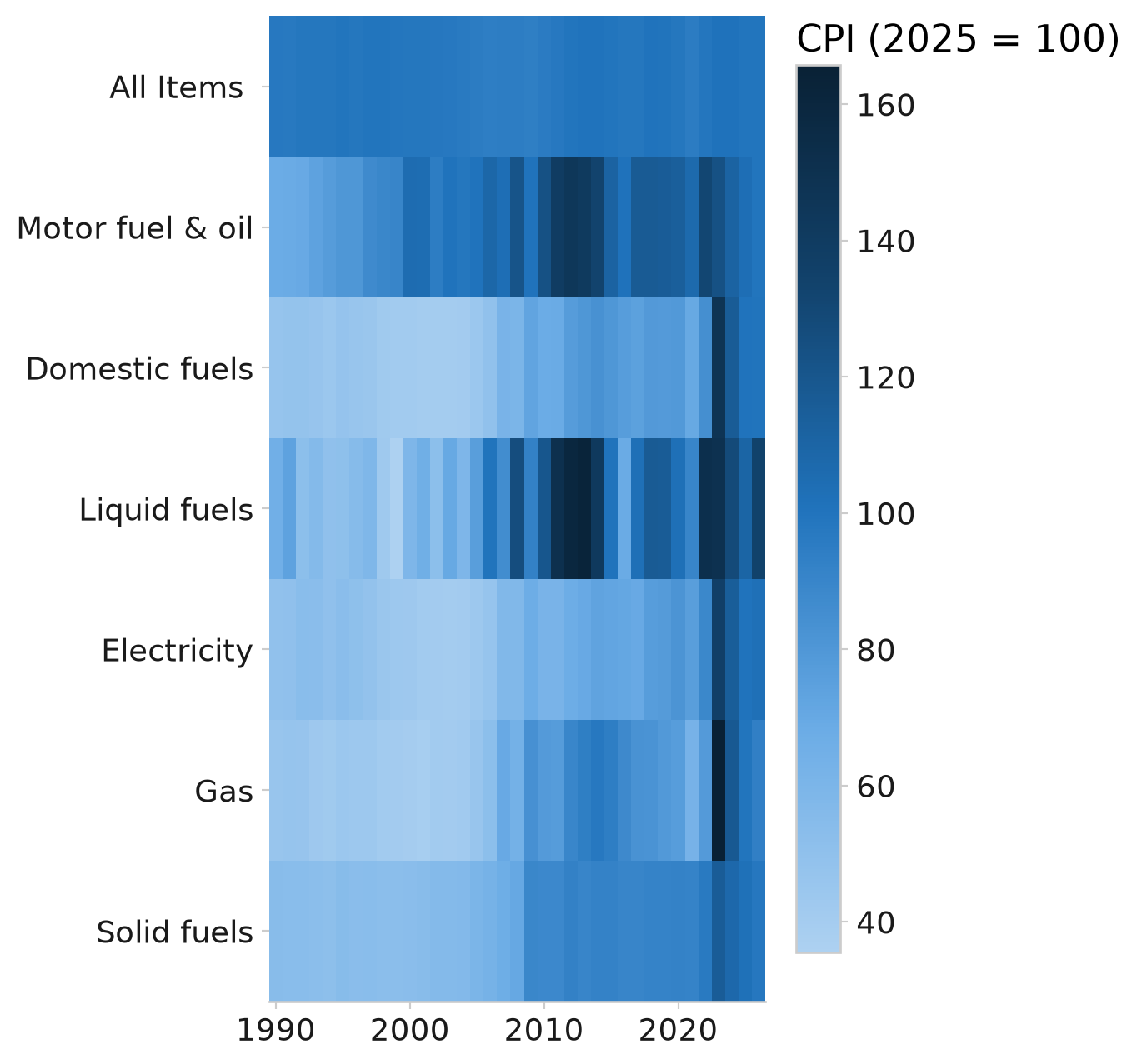
A heatmap displays values in a grid of rows and columns, using colour intensity to show magnitude. In this example, we plot domestic energy price indices by fuel type and year.
The sequential colour palette is used again here. This time, it’s used to generate a Matplotlib colormap, which maps colour continuously across the full range of values — with a colour bar shown alongside the chart to act as a scale.
import numpy as np
import pandas as pd
import matplotlib.pyplot as plt
from matplotlib.colors import LinearSegmentedColormap

from afcharts.af_colours import get_af_colours

# Get the sequential colour palette
sequential = get_af_colours("sequential", number_of_colours=5, include_grey=True)[::-1]

# Slice the palette to remove the grey colour
sequential_slice = sequential[1:]

# Get a Matplotlib colormap from the sequential palette
sequential_cmap = LinearSegmentedColormap.from_list("sequential", sequential_slice)

# Set default theme
plt.style.use("afcharts.afcharts")

df = pd.read_csv("./data/heatmap_example.csv")

df = (
    df[df["Quarter"] == "Jan to Mar"]
    .set_index("Year")
    .drop(columns=["Quarter"])
    .dropna(how="all")
)
df.index = df.index.astype("string")

df.columns = (
    df.columns.str.replace("Real terms price indices: ", "")
    .str.replace(r"(CPI 2025=100)?[ \\n]*\[Note [\d, ]+\]", "", regex=True)
)

for c in df.columns:
    df[c] = pd.to_numeric(df[c], errors="coerce")

fig = plt.figure(figsize=(5, 8))
plt.imshow(df.T, aspect="auto", cmap=sequential_cmap)

plt.gca().invert_yaxis()
plt.xticks(labels=df.index[::10], ticks=np.arange(len(df.index))[::10])
plt.yticks(labels=df.columns, ticks=np.arange(len(df.columns)))
plt.grid(False)

cbar = plt.colorbar(shrink=0.9)
cbar.ax.set_title(label="CPI (2025 = 100)")

fig
Domestic energy price indices in real terms
Heat map of quarterly consumer price indices of fuel components.
Source: https://www.gov.uk/government/statistical-data-sets/monthly-domestic-energy-price-statistics, Data downloaded: 2026-09-18
Heatmap displaying domestic energy price indices for the January–March quarter by year and fuel type. Values are encoded using a colour scale from light to dark to represent lower to higher index values, enabling comparison across fuels and years.
2.10 Annotations
Labelling your chart is often preferable to using a legend, as often this relies on a user matching the legend to the data using colour alone.
You can add an annotation anywhere on a chart using the annotate() method. This is demonstrated above in Line chart with duo palette, which directly labels each line. Note that black text has been used for the labels, as this ensures sufficient contrast against the white background.
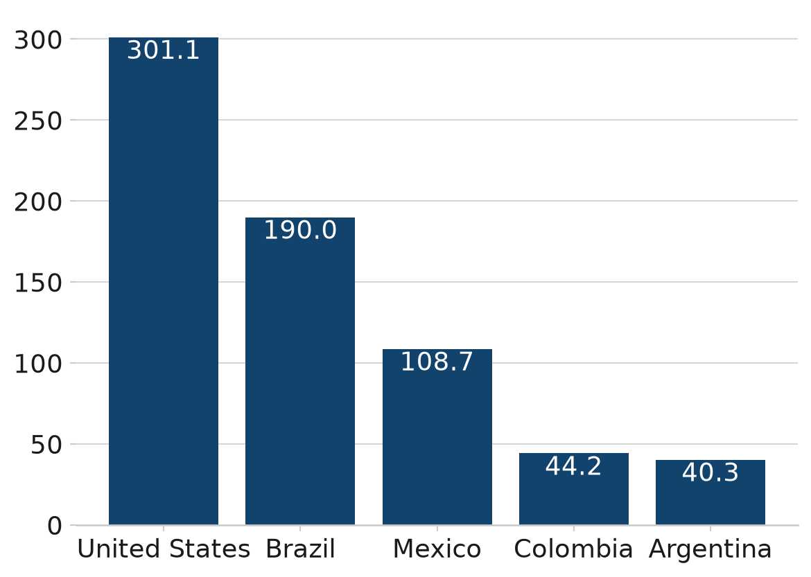
To add value labels to bars in a bar chart, use the bar_label() method. In the example below, the population values are added as white text labels inside the bars.
import matplotlib.pyplot as plt

# Load gapminder dataset from plotly
from plotly.express.data import gapminder

# Set default theme
plt.style.use("afcharts.afcharts")

# Filter for Americas in 2007 and get top 5 by population
df = gapminder().query("year == 2007 & continent == 'Americas'")

top5 = df.nlargest(5, "pop")

fig, ax = plt.subplots()

bars = ax.bar(
    top5["country"],
    top5["pop"] / 1e6,  # Convert to millions
)

# Add text annotations to top of each bar
ax.bar_label(bars, labels=[f'{round(val, 1)}' for val in top5["pop"] / 1e6],
             color='white', padding=-15)

fig
The U.S.A. is the most populous country in the Americas
Population of countries in the Americas (millions), 2007
Source: Gapminder
This bar chart uses the afcharts theme, and shows the populations of the five most populous countries in the Americas. Each bar is dark blue and labelled by country underneath. White text labels are added inside each bar showing the population value in millions. Pale grey grid lines extend out from the y axis.
2.11 Other customisations
2.11.1 Sorting a bar chart
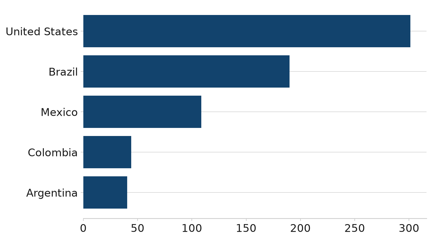
To control the order of bars in a bar chart, sort the data object before plotting. For Pandas data frames, you can use the .sort_values() method. Pass the name or list of names that you would like to sort by and specify whether ascending (True, default) or descending (False). In this below example, the data is sorted on pop and ascending is set to True so that the bars are displayed in ascending order of population.
import matplotlib.pyplot as plt

# Set default theme
plt.style.use("afcharts.afcharts")

# Load the gapminder dataset from plotly.express
from plotly.express.data import gapminder

# Filter for Americas in 2007 and get top 5 by population
df = gapminder().query("year == 2007 & continent == 'Americas'")

top5 = df.nlargest(5, "pop").sort_values("pop", ascending=True)

fig = plt.figure(figsize=(8, 5))
plt.barh(
    top5["country"],
    top5["pop"] / 1e6,  # Convert to millions
)

fig
The U.S.A. is the most populous country in the Americas
Population of countries in the Americas (millions), 2007
Source: Gapminder
This bar chart uses the afcharts theme, and shows the populations of the five most populous countries in the Americas, sorted in ascending order by population. Each bar is dark blue and labelled by country underneath. All text is black in a sans serif font. Pale grey grid lines extend out from the y axis.
2.11.2 Adding a horizontal or vertical line
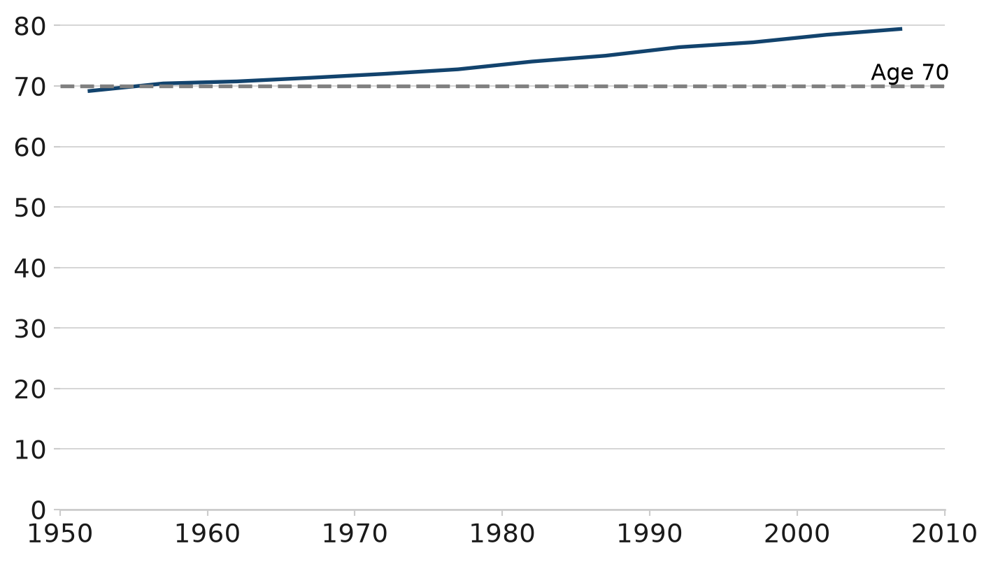
To add a horizontal or vertical line across the whole plot, use axhline() or axvline() respectively. Annotating the line can be achieved using text(). This can be useful to highlight a threshold or average level.
import matplotlib.pyplot as plt

# Set default theme
plt.style.use("afcharts.afcharts")
# Load the gapminder dataset from plotly.express
from plotly.express.data import gapminder

df = gapminder().query("country == 'United Kingdom'")

# Make the figure wider than the default (6.4, 4.8)
fig = plt.figure(figsize=(8.5, 4.8))

plt.plot(df["year"], df["lifeExp"])

# Add a dotted horizontal line for 70 years of age
plt.axhline(y=70, linestyle="--", color="gray", linewidth=2)
plt.text(2005, 71, "Age 70", fontsize=12, fontweight="normal", color="black")

plt.xlim([1950, 2010])
plt.ylim([0, 82])

fig
Living Longer
Life expectancy in the United Kingdom 1952 to 2007
Source: Gapminder
This line chart uses the afcharts theme. There are pale grey grid lines extending from the y axis, and there is a thicker dark blue line representing the data. A dotted horizontal line has been added at 70 years of age, with an annotation to label it.
2.11.3 Saving figures
The afcharts style uses a larger base font size (14pt vs Matplotlib’s default 10pt) for accessibility. The figure.figsize parameter is intentionally not set in the style sheet — the default canvas remains 6.4 × 4.8 inches.
By default, savefig saves at exactly figure.figsize. If you pass bbox_inches='tight', the output is cropped to the bounding box of all content, so dimensions will vary between charts. Avoid this if you need a consistent, fixed output size.
2.11.4 Wrapping text
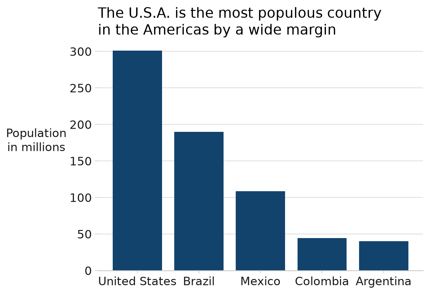
If text is too long, it may be cut off or distort the dimensions of the chart. To avoid this, text can be wrapped to multiple lines using the textwrap module. The width argument controls how many characters are allowed on each line before wrapping. See the figure title below for an example.
Alternatively, you can manually add line breaks by inserting \n into the text string to control where the text is wrapped. See the y-axis label in the figure below for an example.
import textwrap
import matplotlib.pyplot as plt

# Set default theme
plt.style.use("afcharts.afcharts")

# Load the gapminder dataset from plotly.express
from plotly.express.data import gapminder

df = gapminder().query("year == 2007 & continent == 'Americas'")

top5 = df.nlargest(5, "pop")

fig = plt.figure()

plt.bar(top5["country"], top5["pop"] / 1e6)

plt.title(
    textwrap.fill(
        "The U.S.A. is the most populous country in the Americas by a wide margin",
        width=40,
    )
)
plt.ylabel("Population\nin millions", rotation=0, labelpad=40)

fig
The U.S.A. is the most populous country in the Americas
Population of countries in the Americas (millions), 2007
Source: Gapminder
In this bar chart image, the y-axis label and chart title text have been wrapped onto two lines so that all the text is visible without being cut off.
2.12 Revert to Matplotlib default
To revert to Matplotlib’s default settings after applying the afcharts style:
import matplotlib.pyplot as plt

# Revert to Matplotlib's default style
plt.style.use("default")